The clearPath Dashboard
The dashboard is the home page of clearPath. Sixty-plus widgets cover hand hygiene compliance, the five moments of hand hygiene, custom audits, statistical-process-control charts, Joint Commission tracer indicators, the Leapfrog Hospital Survey, gamified challenges, and audit-program operations. Open the type picker from any card, pick the widget you need, and it goes live against your data.
Every card respects the dashboard filter bar — account, facility, unit, and time period — so the same screen rescopes from a single ICU to an enterprise roll-up without rebuilding anything. Available on every clearPath edition; widget breadth scales with the edition.
Request a Demo Compare EditionsKey Benefits
- 60+ widgets out of the box
- Live data — no nightly refresh
- Filter by account, facility, unit, time period
- Targets and color ranges per account
- Drag-and-drop layout, per-user
- Drill from any card to a full-page detail
- Statistical-process-control built in
- Joint Commission and Leapfrog views
- Lobby and huddle-board friendly
- Export any chart as a PNG
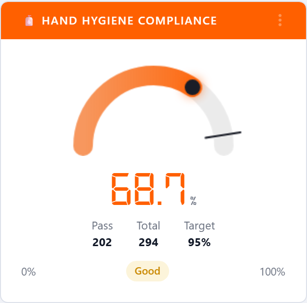
Hand Hygiene Compliance
The flagship gauge. Plots the percentage of hand-hygiene moments that were performed against the total opportunities recorded in the selected period, with the target marker pulled from the targets table. The status pill — Excellent, Good, Fair, Poor — is driven by your account's color ranges, so the same gauge speaks the same language across every facility.
- Live percentage against your configured target
- Color-coded by account thresholds
- Hawthorne-adjusted variant for executive reporting
- Drill into observations behind the number

Moments Radar
A radar chart that plots compliance for each of the five moments of hand hygiene at once. The shaded area shows uneven performance instantly — strong on Before Patient Contact but weak on After Body Fluid Exposure jumps off the screen, where a table of percentages would not.
- All five WHO moments on one chart
- Per-moment gauges available alongside
- Honors your moment methodology (4 or 5 moments)
- Filter to a single unit or roll up to the enterprise
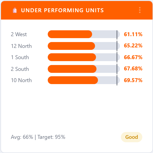
Under-Performing Units
A horizontal bar chart of the bottom-N units by compliance, with the account average drawn as a reference line. Use it to pick the units that need coaching, extra audits, or a unit-leader conversation this week. A mirror widget — Best Performing Units — drives recognition programs and surfaces internal best practices to copy.
- Bottom-N (or top-N) by compliance
- Account average drawn as a reference line
- Bars colored by your account's range thresholds
- Drill into any unit's observation history

Overview Tree
A hierarchical org tree that summarizes compliance from corporation down to facility, unit, and — optionally — healthcare-provider type. Click any node to drill deeper without leaving the dashboard. For multi-site organizations this is the fastest way to find the one unit at one facility that's dragging the network number down.
- Corporation → facility → unit → HCP
- Click-to-drill, in place
- Color-coded by compliance band
- Live counts and percentages at every level
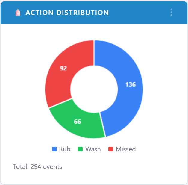
Hygiene Action Distribution
A pie chart of how observed moments resolved — rub, wash, or missed. It answers a question the gauge can't: is non-compliance dominated by misses, or by wrong-product choices? A facility hitting 70% with 25% misses is a different problem than a facility hitting 70% with 5% misses and a heavy wash bias.
- Rub vs. wash vs. miss breakdown
- Companion Rub vs Wash vs Both widget for sanitizer / soap mix
- Filterable by unit, HCP type, or program
- Pairs with the compliance gauge for context
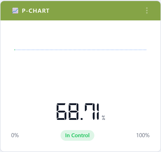
Statistical-Process-Control Charts
Is this real, or just noise? The clearPath dashboard answers that question with a full kit of SPC charts — P-Chart with 3-sigma control limits, run charts with the eight-points-on-one-side rule, confidence-interval bands, CUSUM for drift detection, Pareto for the 80/20 view, and funnel plots that account for sample size. Every chart opens into a full-page detail view via the card's More action.
- P-Chart with control limits
- HCP run chart
- Compliance confidence band
- Standard deviation trend
- Pareto — hand hygiene
- Pareto — custom audits
- CUSUM — hand hygiene
- CUSUM — custom audits
- Funnel plot — hand hygiene
- Funnel plot — custom audits
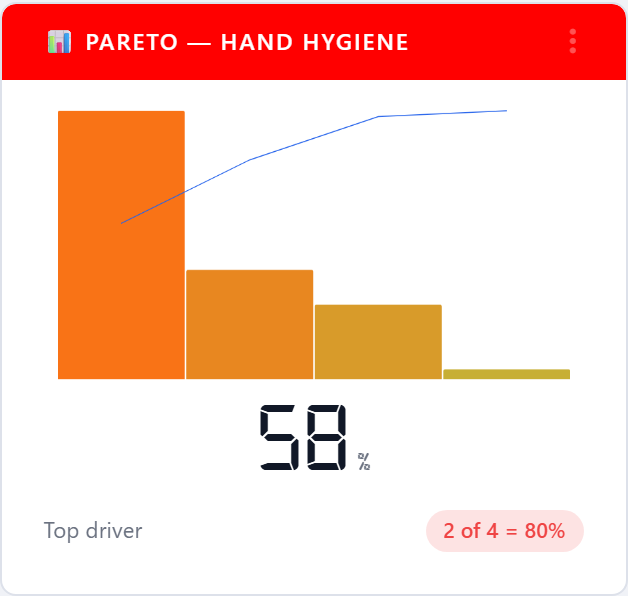
Pareto Chart
The 80/20 view: a small number of units — or HCP types, or moments, or audit questions — typically drive most of the non-compliance. The Pareto chart finds them. Sort the bars descending, draw the cumulative line, and the conversation moves from "everything is a problem" to "these three things are 70% of the problem."
- Bars and cumulative percentage line
- Switch grouping: unit, HCP type, moment, audit
- Drill from any bar to the supporting observations
- Companion Custom Audit Pareto for non-hygiene programs
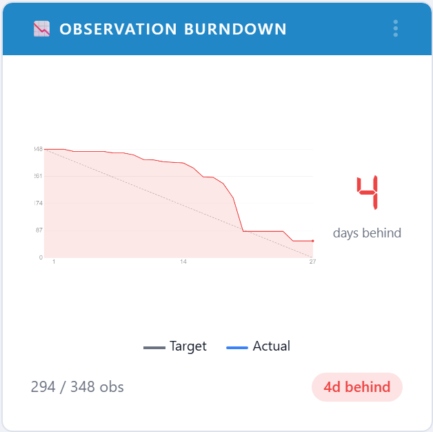
Observation Burndown
Plots cumulative observations against the daily target line for the current period. The slope of the actual line tells you whether you'll land on target without doing the math — and whether to send an extra auditor out tomorrow or wait until next week. Pairs with Audit Progress, Last Audited, and Suggested Auditing Areas as a complete worklist for the infection-prevention team.
- Cumulative observations vs. target line
- Project end-of-period landing from current slope
- Per-facility and per-unit views
- Companion widgets for last-audited and suggested-auditing
Joint Commission & Leapfrog
Two widget families purpose-built for the surveys infection-prevention teams actually face. The TJC block surfaces open action plans, sample adequacy by unit, and observer competency expirations — the indicators most often requested in a Joint Commission infection-prevention tracer. The Leapfrog block maps onto the five domains of the 2026 Leapfrog Hand Hygiene Standard — Monitoring, Feedback, Training & Education, Infrastructure, and Culture — plus the operational widgets that drive Path A vs. Path B readiness: volume, coverage, submission window, and follow-ups.
- TJC Open Action Plans
- TJC Sample Adequacy
- TJC Observer Competency
- Leapfrog Monitoring
- Leapfrog Feedback
- Leapfrog Training & Education
- Leapfrog Infrastructure
- Leapfrog Culture
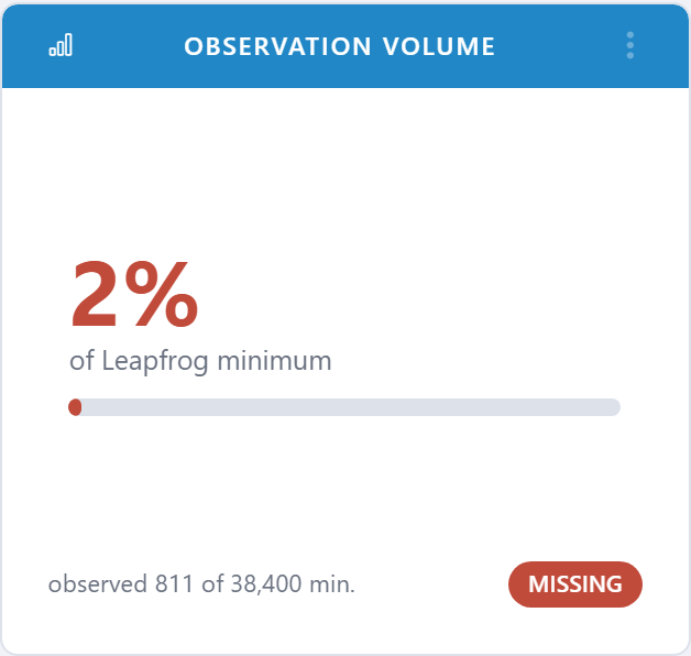
- Observation volume vs. Path A / Path B targets
- Unit coverage
- Submission window countdown
- Open follow-ups
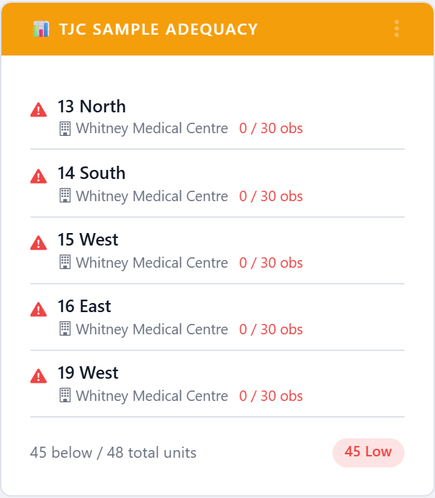
TJC Sample Adequacy
Flags units whose observation sample for the period is below the minimum count Joint Commission expects. The bars are the worklist — they are the units that need a visit before the cycle closes. Most Frequently Audited HCP and Least Frequently Audited HCP answer the same question on the HCP-type side, the first place to look when surveyors ask about sample coverage.
- Below-threshold units, ranked by gap
- Per-account sample-size minimums
- Companion HCP-type frequency widgets
- Drives a survey-ready coverage story
Custom Audit Compliance
Compliance gauges and bar charts for every active custom audit on the account — PPE bundles, central-line bundles, discharge education, surveys, and anything else your Quality team has built. Custom-audit widgets share the dashboard's filter bar and SPC kit, so a PPE audit and a hand-hygiene audit get the same statistical treatment.
- Per-audit compliance gauge
- Compliance by Audit Type bar chart
- Net Promoter Score for survey-style audits
- Pareto, CUSUM, and funnel plots restricted to custom audits
Challenges & Recognition
Gamification widgets for clearPath's challenges program — active challenges with participant counts and time remaining, leaderboards by challenge points, all-time points leaders, and a recent-badges feed that doubles as recognition content for break-room displays. The same widgets that drive engagement in IPC standups make excellent lobby content too.
- Active Challenges
- Challenge Leaderboard
- All-time Points Leaders
- Recent Badges feed
One Canvas. Every Question Your Team Asks.
From a flagship compliance gauge to a Joint Commission readiness pack to a Leapfrog submission countdown — the clearPath dashboard ships with the cards your infection-prevention team already wants. Pick the layout you need, save it per user, and watch it update live as observations roll in.
Request a Demo Compare Editions