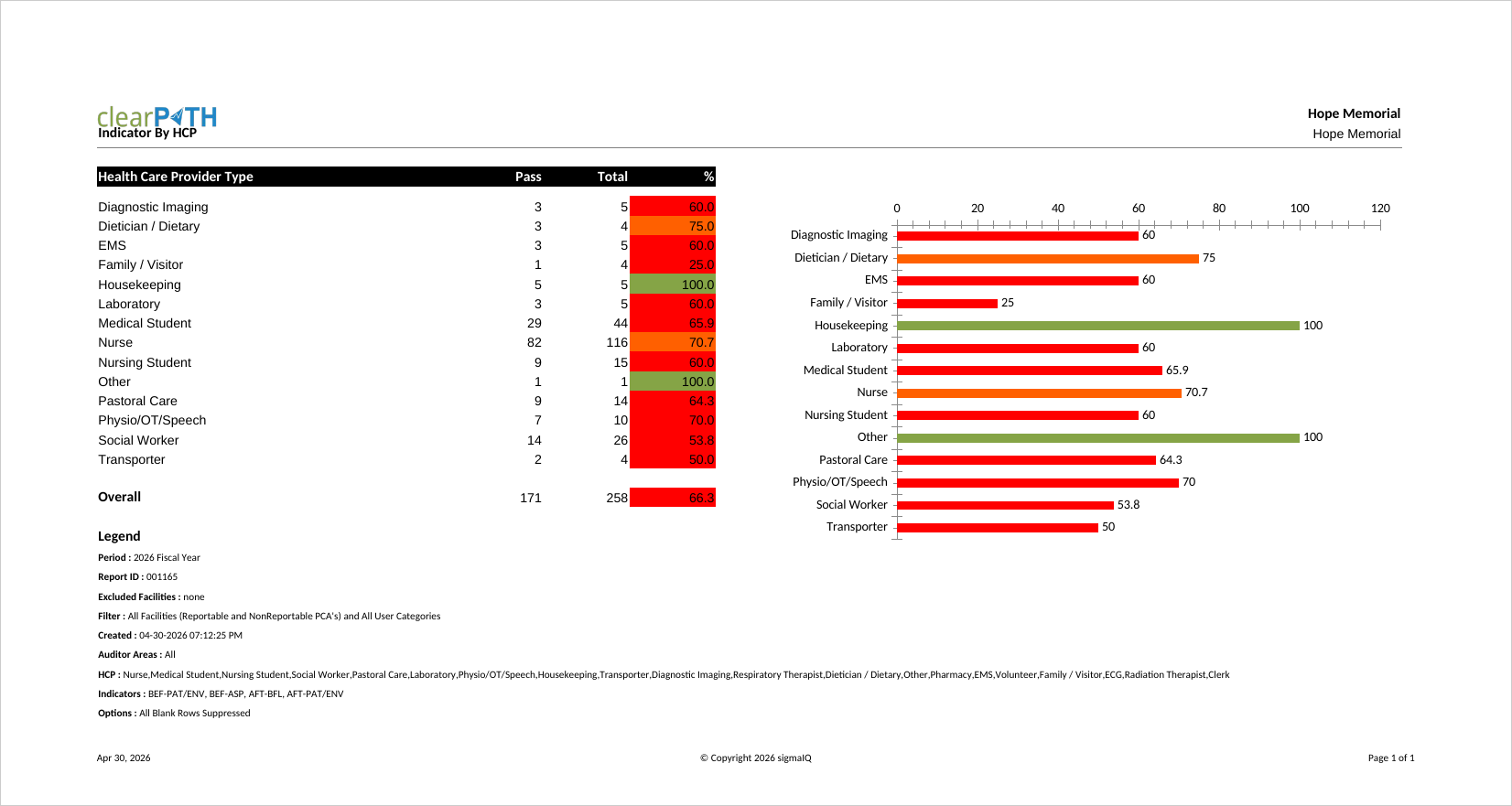
Indicator By HCP
Hand hygiene compliance for a single indicator (moment of care), broken down by health care provider type. Infection prevention staff and unit managers use it for a quick, at-a-glance view of how each HCP type is performing against a single moment, making it ideal for highlighting top and bottom performers in a compact format.
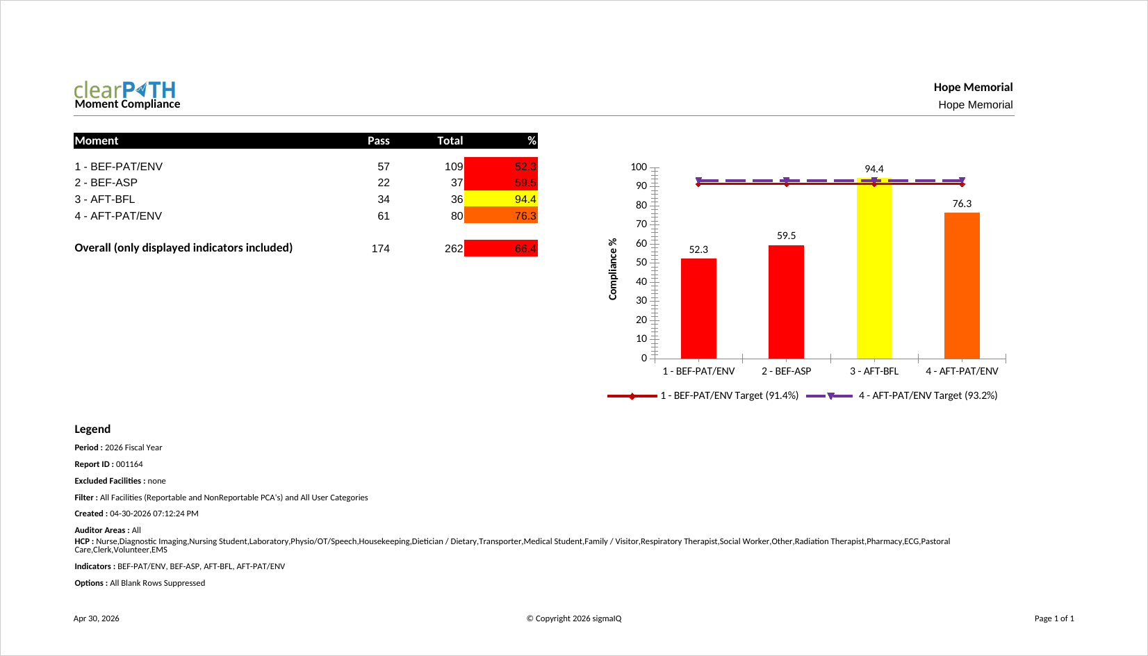
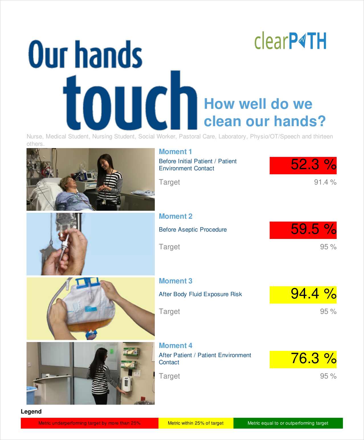
Moment Compliance
One of the original six Ontario Ministry of Health reports. Displays the distribution of hand hygiene techniques (rub, wash, or both) across a Facility, Patient Care Area, Unit, or Program as a percentage. Use it to validate that alcohol-based hand rub is the predominant technique in clinical areas.
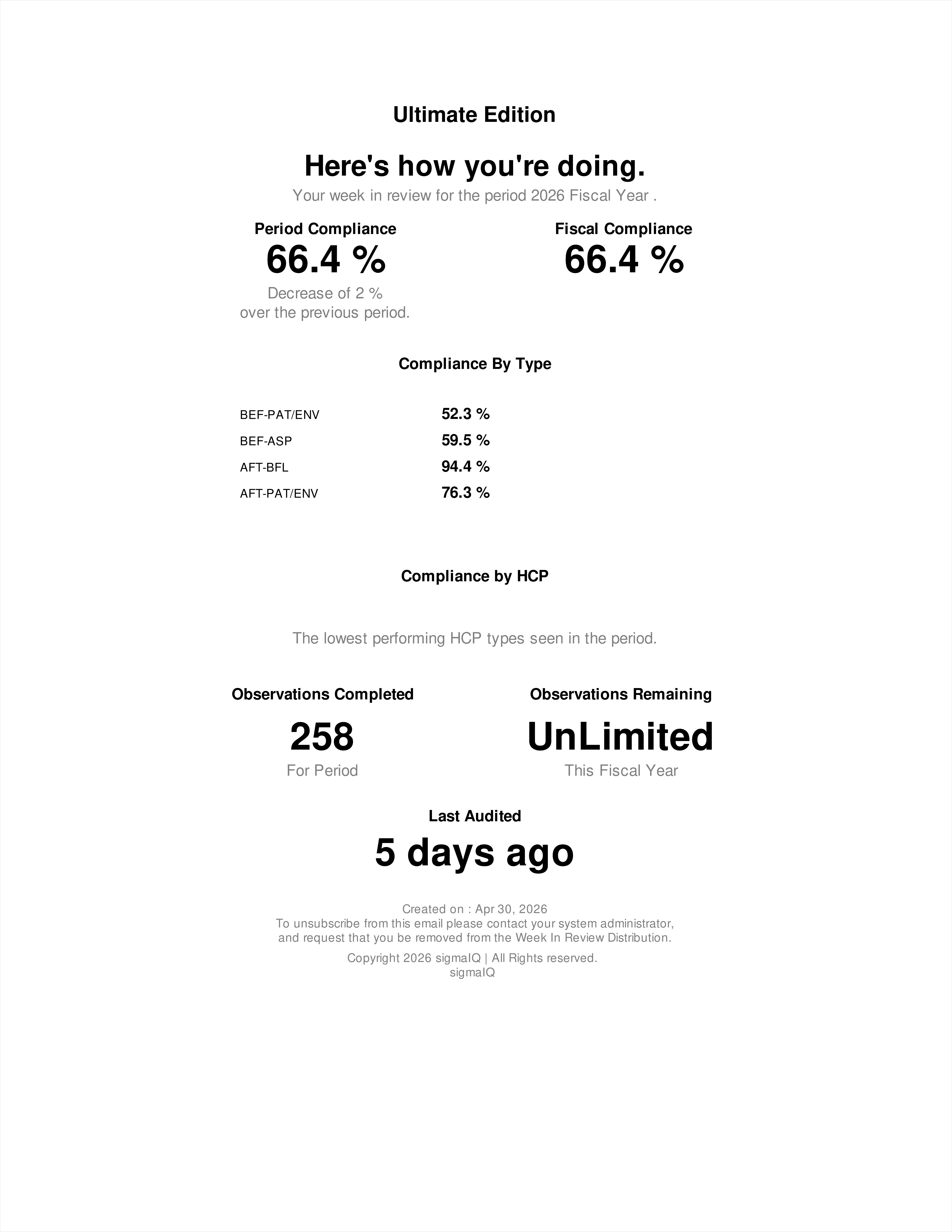
Week In Review
A one-page recap of auditing activity over the previous week. It highlights observations collected, compliance at a glance, and notable events. Front-line managers and infection prevention leads circulate it as a quick status update without the overhead of a full monthly report.
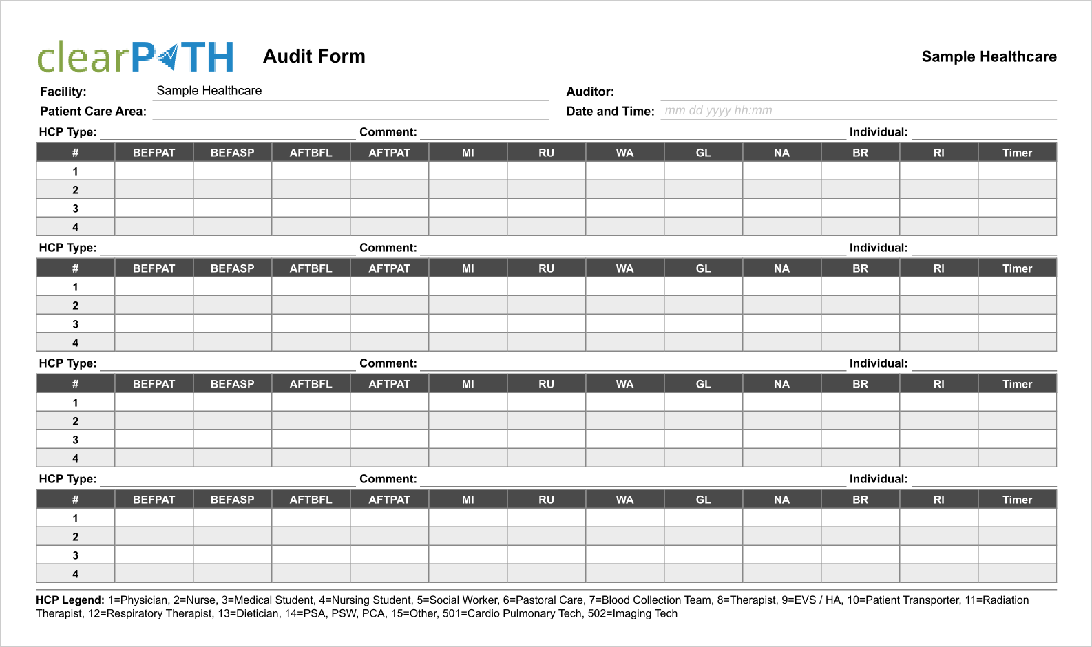
Audit Form
A printable paper audit form generated with your unique set of health care providers and indexed to match what auditors see in the mobile app. Useful where a mobile device isn't practical or as a training aid for new auditors. Out of the box clearPath supports English, Spanish, and French; other languages are available on request.
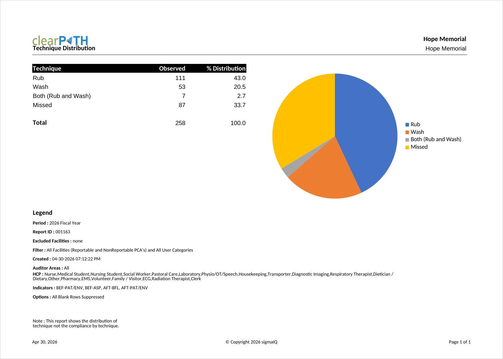
Technique Distribution
One of the original six Ontario Ministry of Health reports. Shows the breakdown of hand hygiene technique (rub, wash, or both) for a Facility, Patient Care Area, Unit, or Program as a percentage. Infection prevention programs use it to monitor adoption of alcohol-based hand rub versus soap and water.
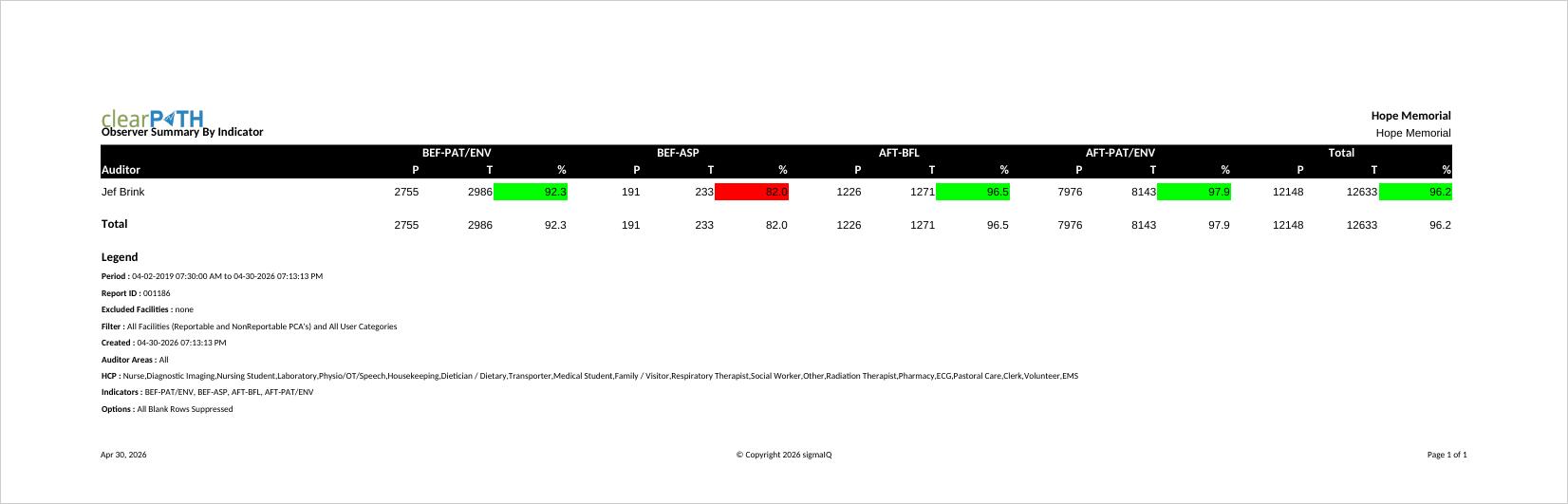
Observation Summary By Indicator
Summarizes observations for each observer broken down by indicator (moment). Audit program leads use it to review how individual observers distribute their observations across the moments of care, which helps detect bias or gaps in coverage.
Calendar
Key contact information for the facility along with any defined key dates. Often printed and posted in staff areas so that auditing milestones, hand hygiene week, and other events are visible at a glance.
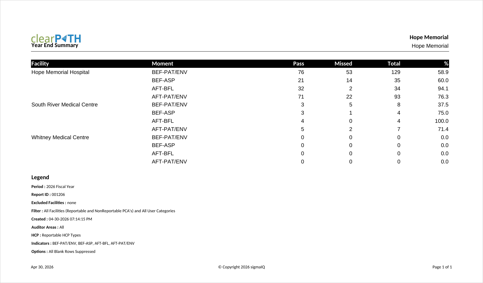
Year End Summary
A simplified, ready-to-publish annual summary that intentionally removes most of the options found on other reports. Only units that are active, unlocked, and reportable are included. Commonly used to prepare an organization's public annual report on hand hygiene performance.
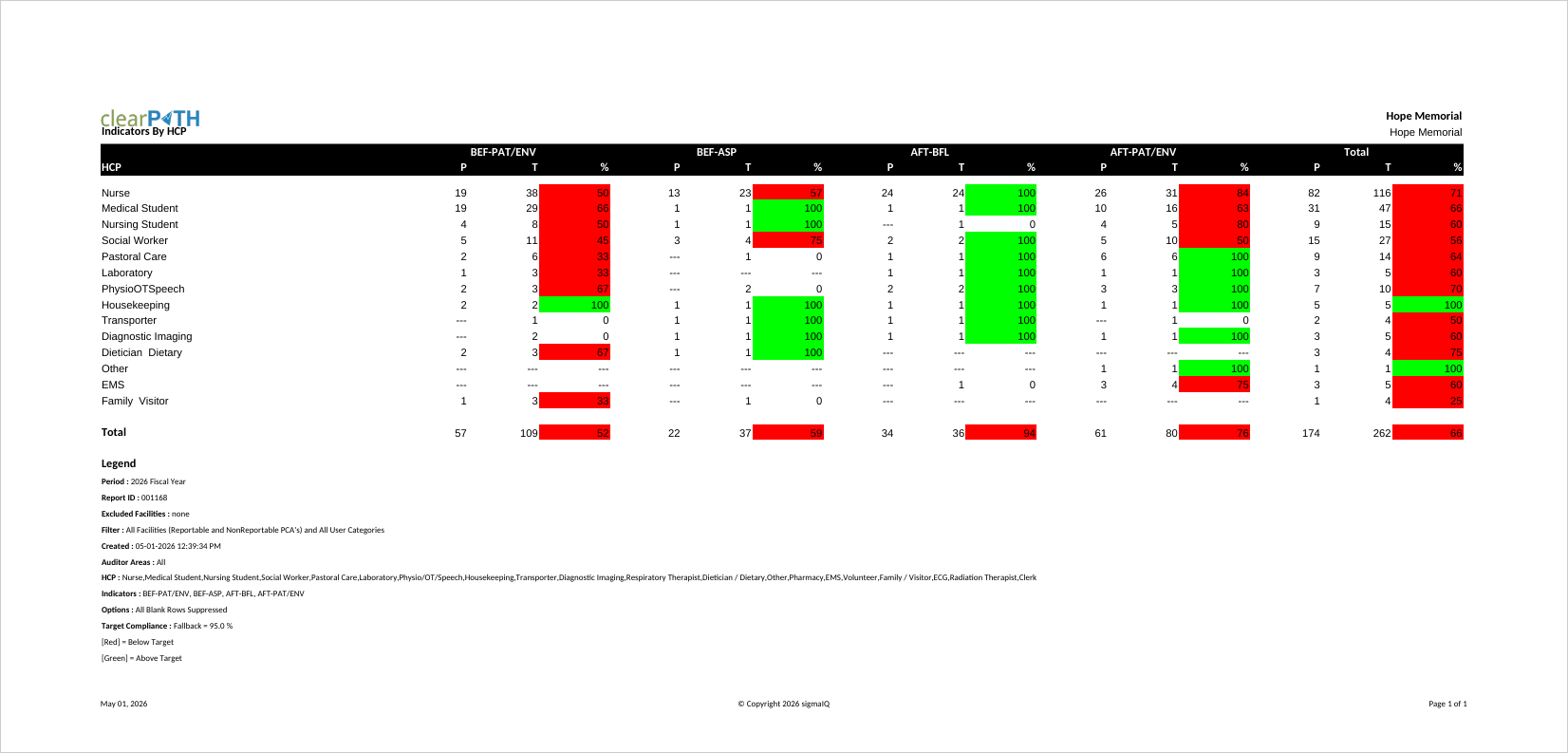
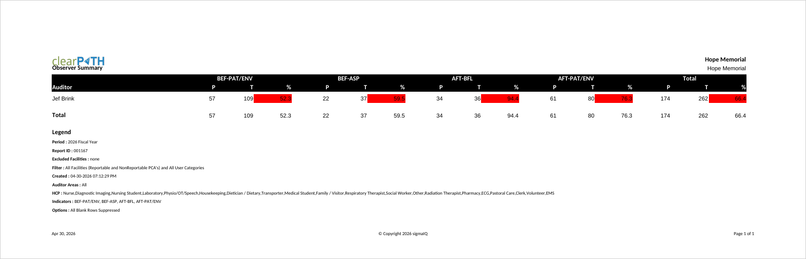
Indicators By HCP
Compliance for every indicator (moment) broken out by health care provider type in a single report. Quality leads, educators, and unit managers use it to identify which moments a specific HCP group struggles with, so targeted education can be provided. Two layouts are available: a side-by-side view for screen and PDF, and a Facility / Unit grouping for cross-unit comparisons.
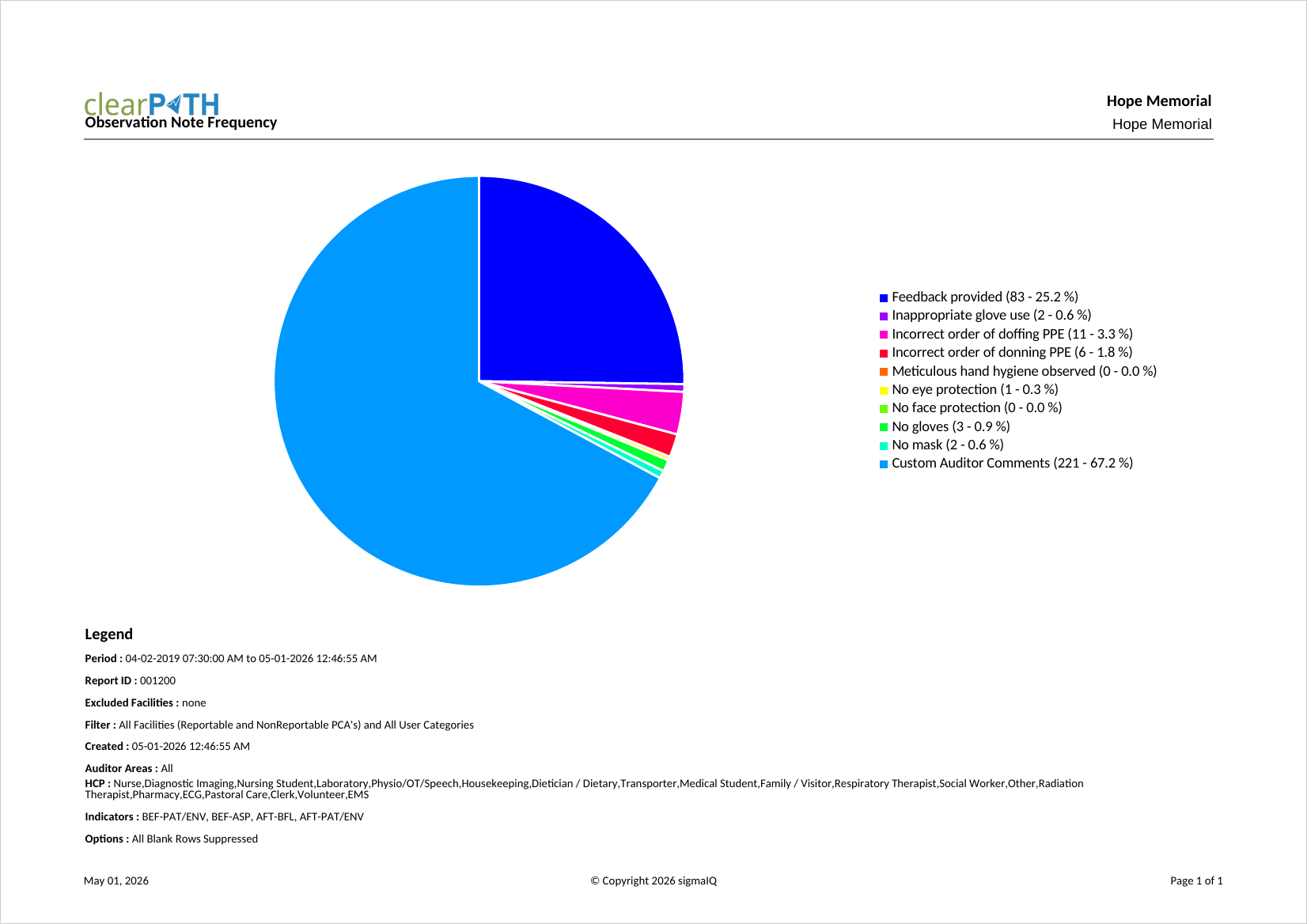
Observation Note Frequency
Determines how often each canned and custom comment is used by auditors across your organization. Most useful when predefined comments have been configured. Quality and education leads use it to surface recurring issues and decide which canned comments are worth keeping.
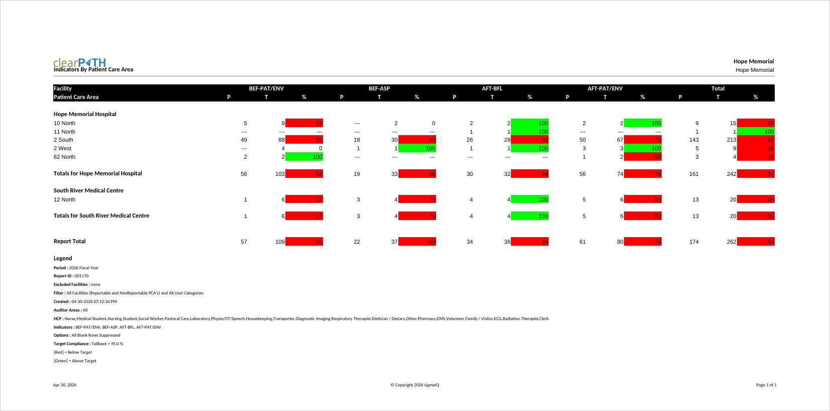
Indicators by Patient Care Area
Compliance for every indicator broken out by Patient Care Area. Unit managers and quality teams use it to compare moment-level performance across units and to identify where to focus improvement efforts. Two styles support both on-screen review and legacy CSV export pipelines.
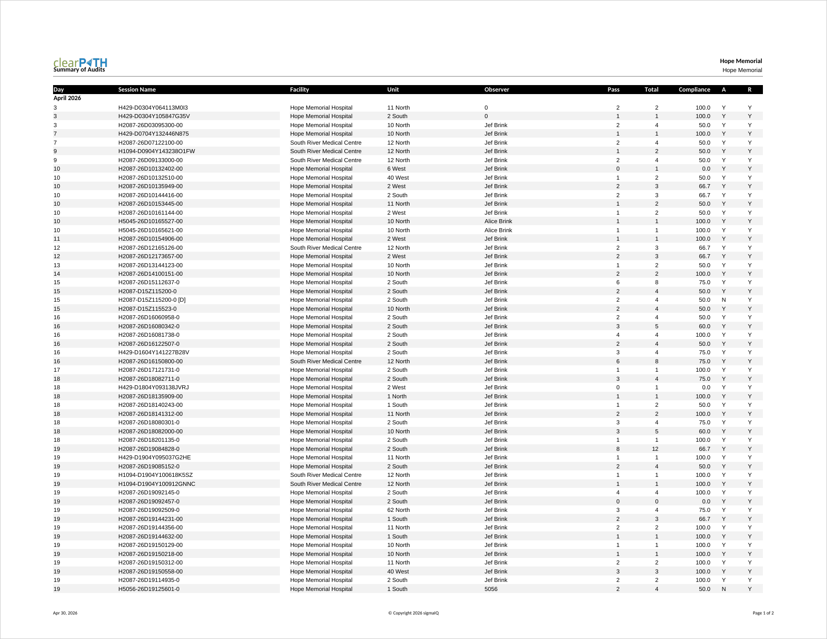
Summary of Audits
Lists the audits completed by month and day, along with facility, unit, observer, compliance, session state, and reportable unit status. Audit program managers use it as an operational log to confirm that auditing is happening as scheduled and that no sessions were left in an incomplete state.
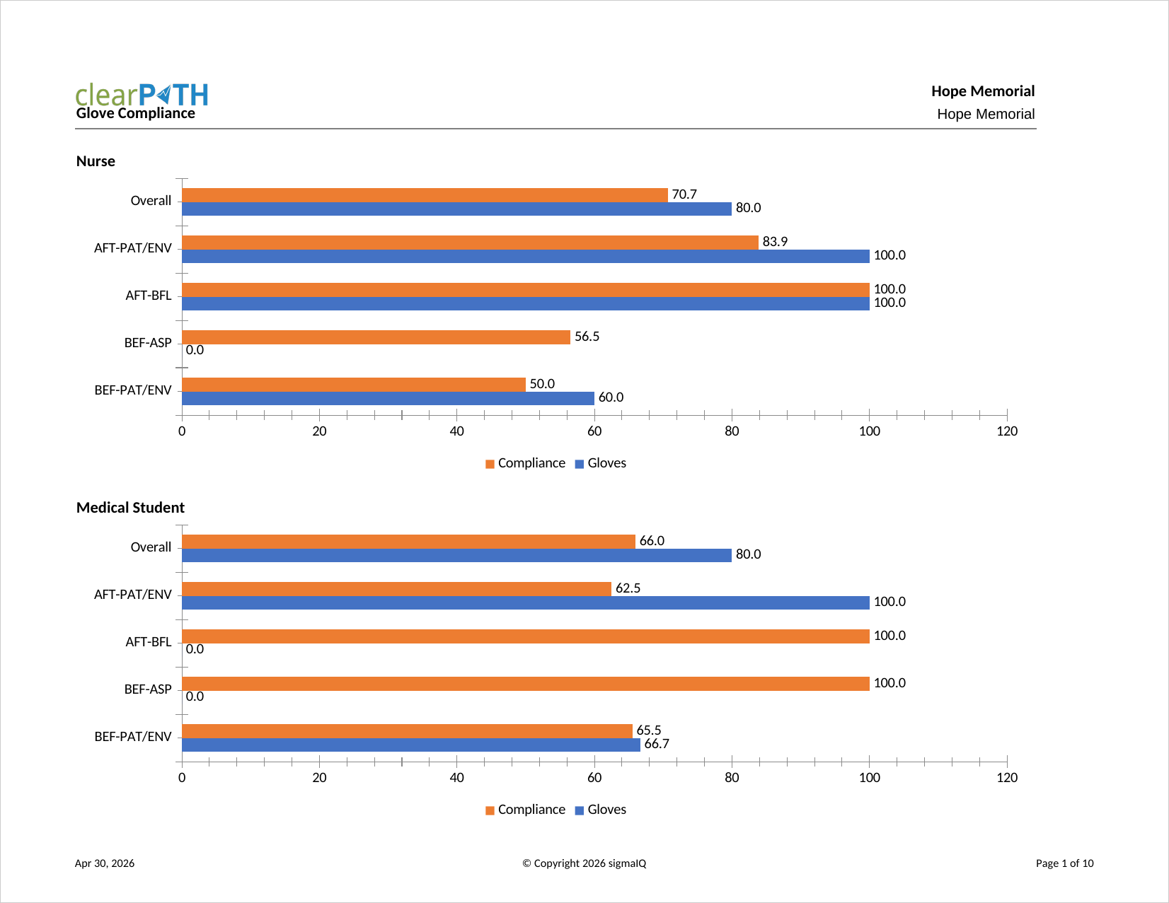
Glove Compliance
Compares compliance when glove usage is observed versus compliance when glove usage is ignored. Infection prevention teams use it to confirm that glove use is not being substituted for hand hygiene, particularly around moments 2 (Before Aseptic) and 3 (After Body Fluid).
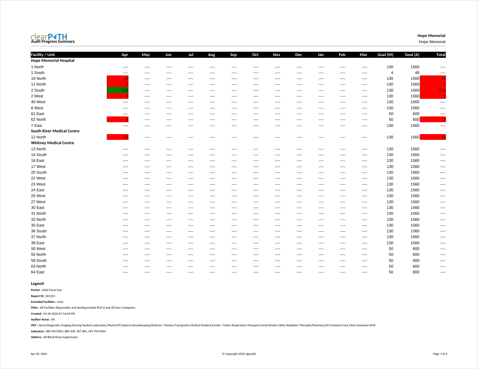
Audit Progress Summary
Confirms that the number of observations collected is tracking to the targets defined in each patient care area's audit schedule. Months below target are shown in red, months at or above target are shown in green, and the total column on the right shows the overall status of the unit.
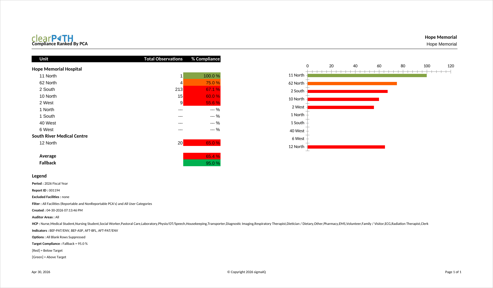
Compliance Ranked By PCA
Compliance ranked by patient care area. The corporate target is shown along with the average compliance across all units. Colour coding follows your account's colour range settings, and the bar to the left of each unit indicates whether the unit meets the target (green) or falls short (red). Senior leaders use this ranking to identify top and bottom performers.
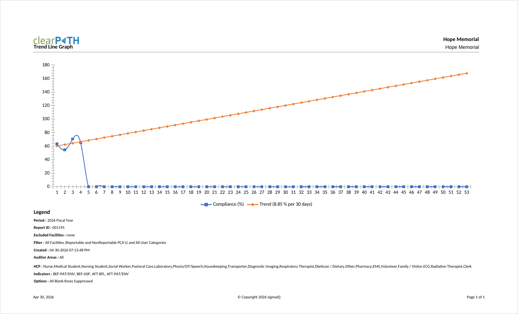
Trend Line Graph
A two-series report that shows weekly hand hygiene compliance over the report period along with a best-fit trend line for the same period. Each bar represents a single week. The legend reports the slope of the trend line, expressed as the percent increase or decrease in compliance projected in thirty-week increments.
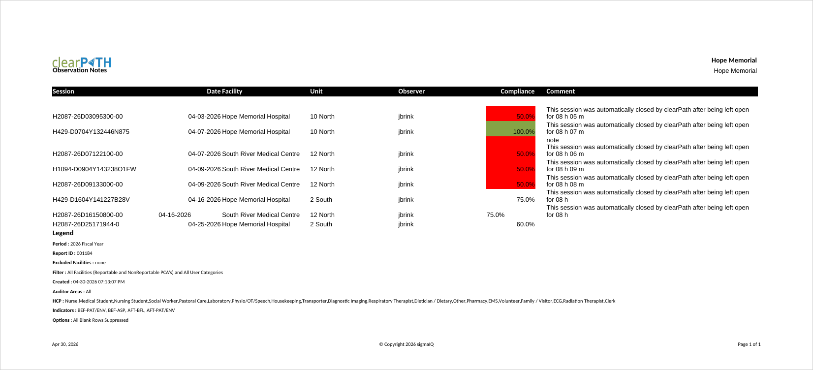
Observation Notes
Comments entered by the auditor during an audit session, organized by date and time. The report can include the main session comment, scratchpad notes, and health care provider-specific notes. Quality leads use it to review the qualitative context around quantitative compliance numbers.
Observer Summary
Lists every auditor active during the report period along with the number of sessions and observations they collected. Audit program leads use it to confirm that the workload is evenly distributed across the auditor pool and to identify auditors who may need additional support or coaching.
Poster Reports
Single-page, portrait-mode reports designed to be printed and posted in patient care areas or staff areas. Posters can show compliance for the corporation, a single facility, a unit, or a program group. Four poster styles are available, including a stop-light visual variant and an information-dense Week-In-Review style with the bottom ten performing HCPs.
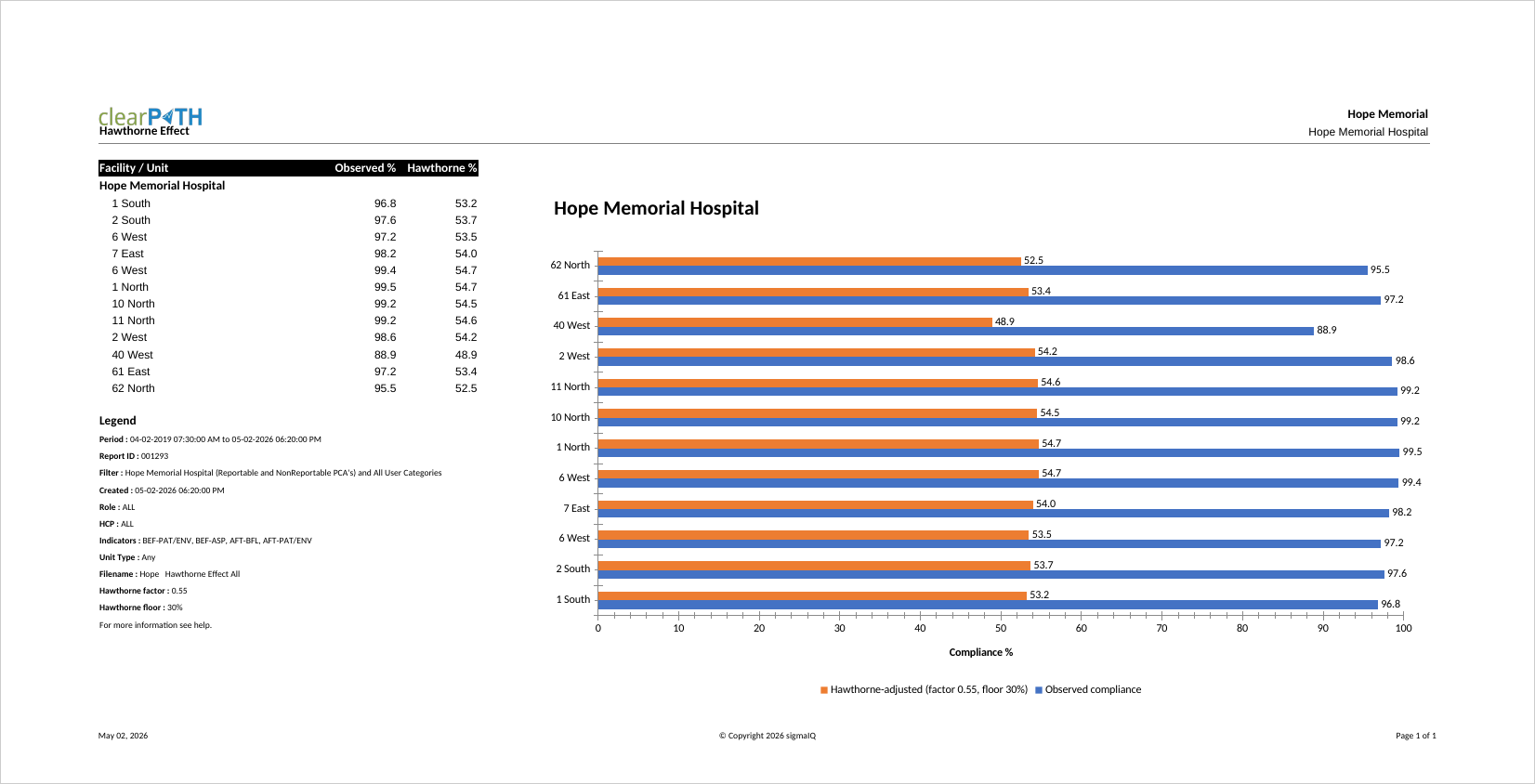
Hawthorne Effect
Estimates true unobserved hand hygiene compliance from the observed compliance captured by auditors. Direct observation is known to inflate measured compliance because subjects modify behavior when they know they are being watched. The report applies an account-level Hawthorne factor (default 0.55) and floor (default 30%) to the observed rate, displaying both observed and Hawthorne-adjusted values side by side along with a companion bar chart. IPC leaders use it to present a more conservative view of compliance to senior leadership.
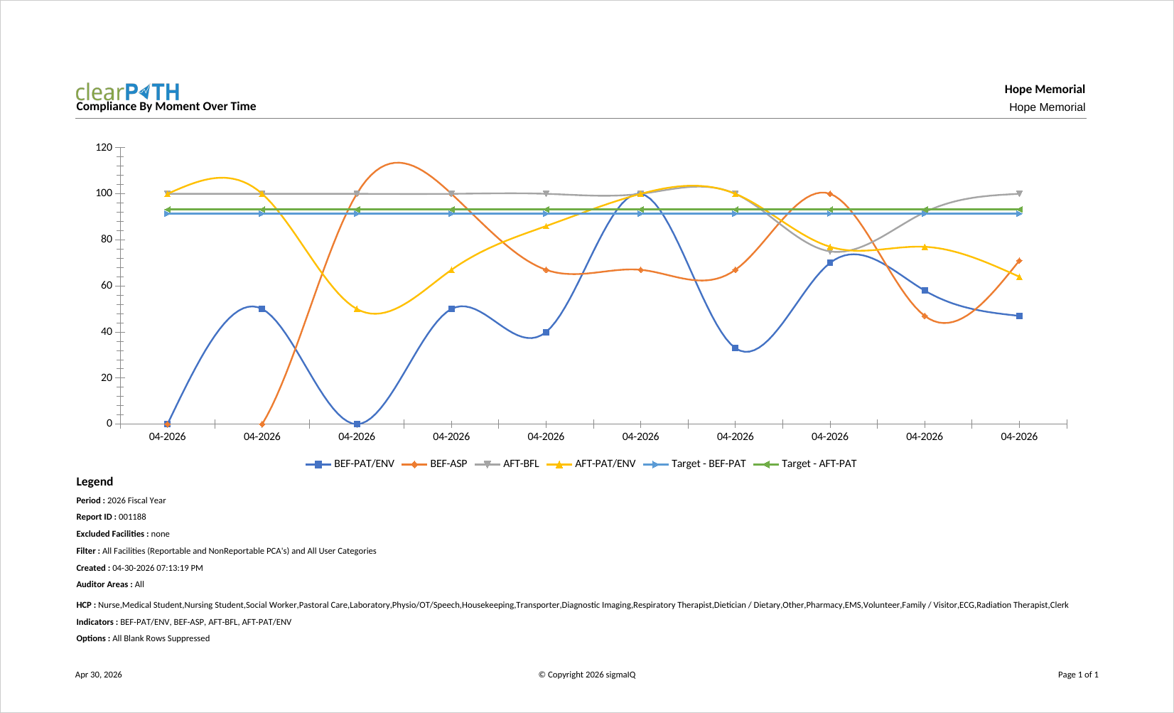
Compliance Over Time Graph
Plots hand hygiene compliance across the report period so that trends can be evaluated visually. Each data point represents a time slice (typically a month). Quality leaders typically pair this graph with the Trend Line Graph when presenting to senior leadership.
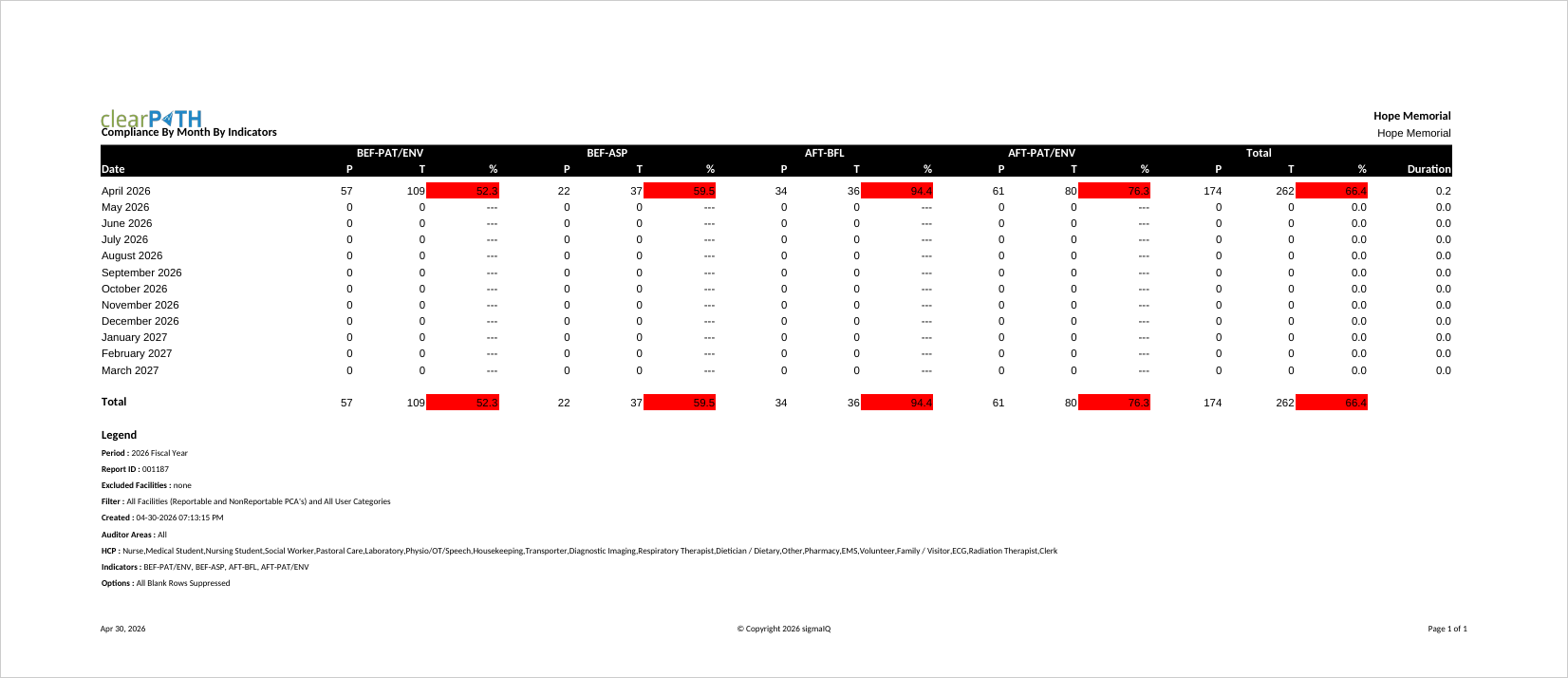
Compliance By Month by Indicators
Breaks compliance down by calendar month and by indicator, so you can see which moments are driving overall performance in any given month. Most often used to support root-cause analysis when a dip in compliance is observed for a particular month.
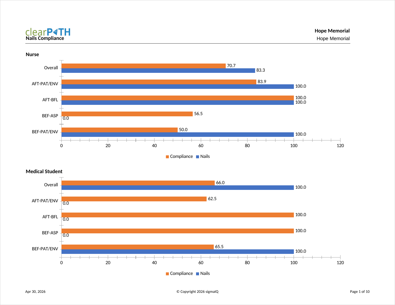
Nails Compliance
Hand hygiene compliance for observations where artificial or long nails were observed, versus observations where they were not. Used by infection prevention committees that enforce a no-artificial-nails policy for clinical staff.
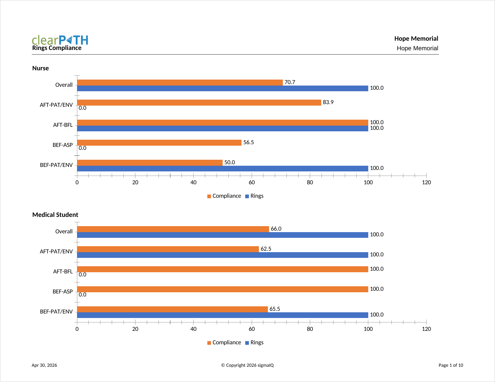
Rings Compliance
Hand hygiene compliance for observations where rings were observed, versus observations where no rings were observed. Supports dress-code policies that restrict jewellery on hands in clinical settings.
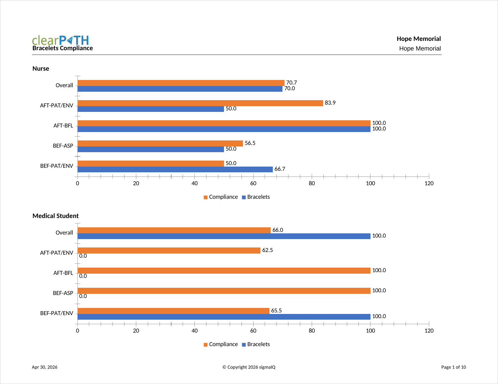
Bracelet Compliance
Hand hygiene compliance for observations where bracelets were observed, versus observations where no bracelets were observed. Like the Rings and Nails reports, it supports enforcement of hand and wrist dress-code policies.
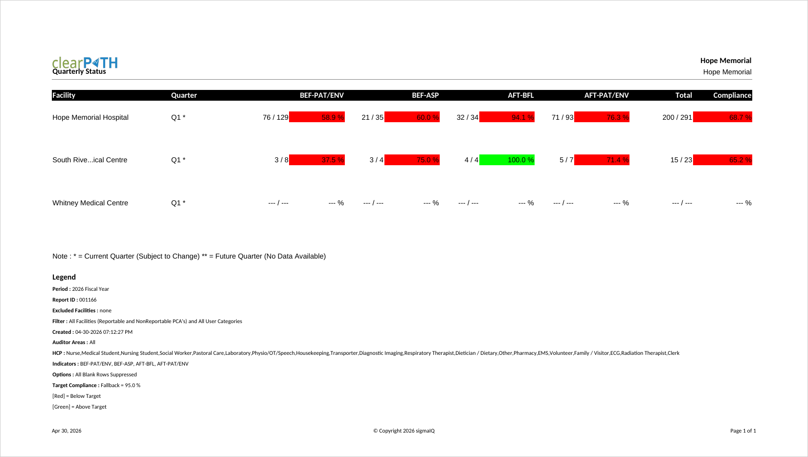
Quarterly Status
Compliance broken down by hospital and quarter. Each moment is shown along with the overall compliance. Quarters with no data are shown blank, and the current incomplete quarter only displays data collected to date.
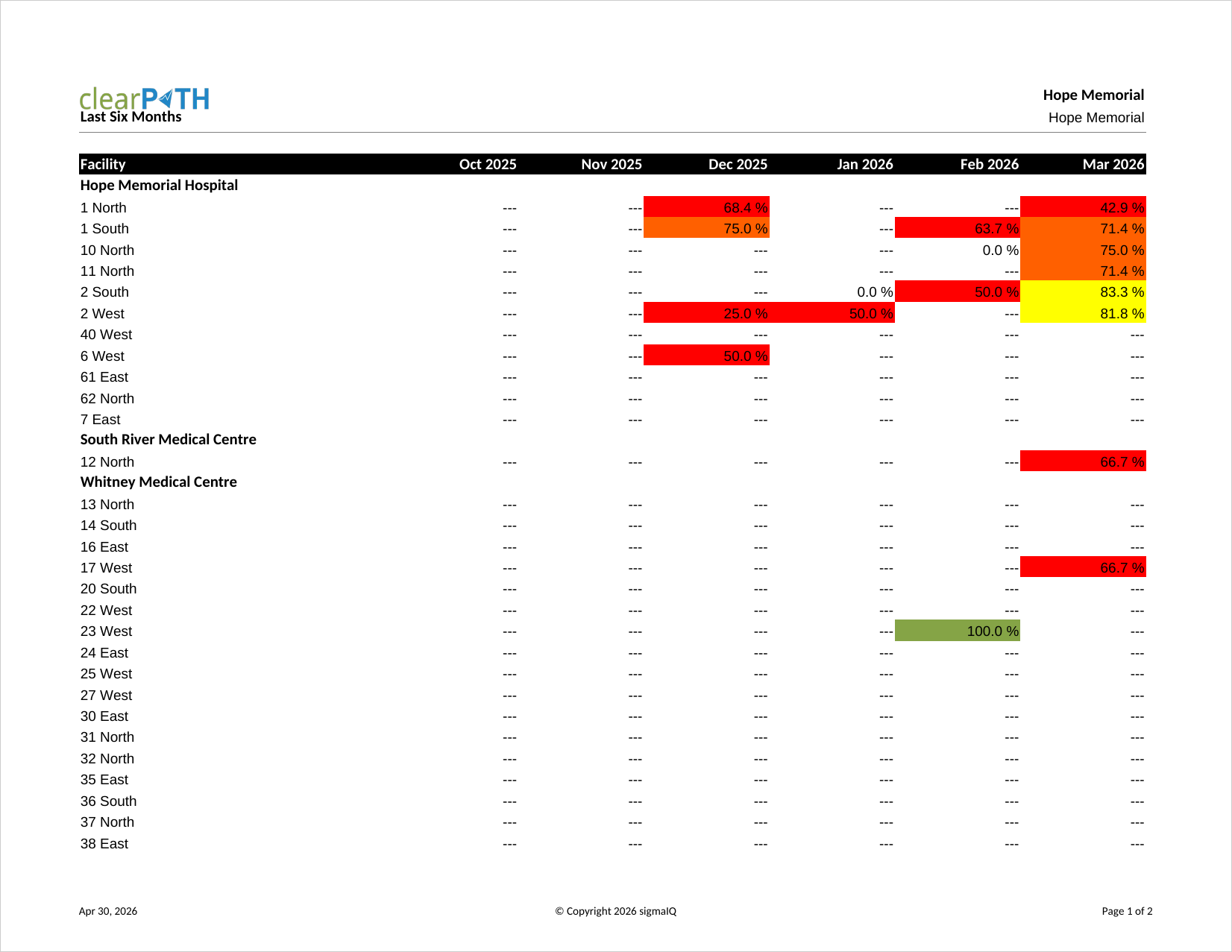
Last Six Months
Hand hygiene compliance for each of the six most recently completed months. The report period is defined by the report itself, so the “from” and “to” dates on the report definition are ignored. Commonly used on monthly quality scorecards.
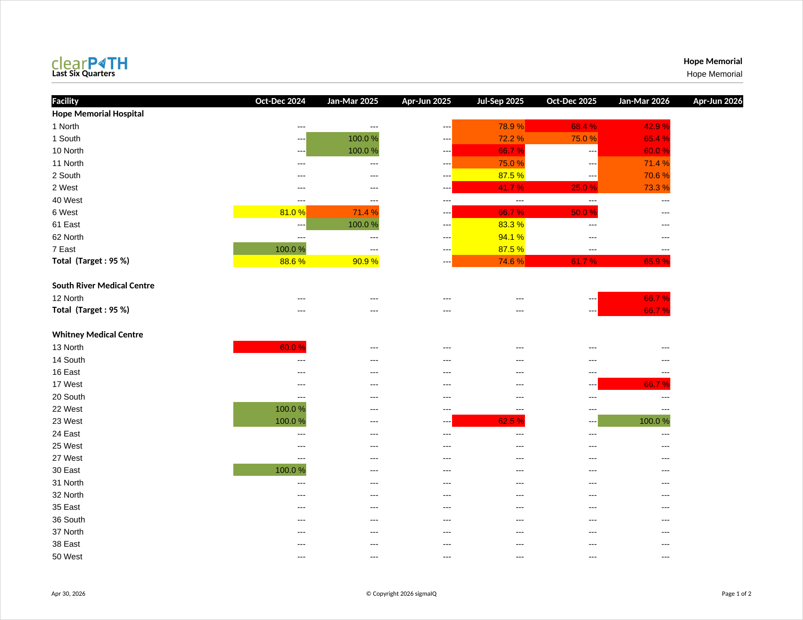
Last Six Quarters
Hand hygiene compliance for each of the six most recently completed quarters. Like Last Six Months, the period is defined by the report itself and the date fields on the report definition are ignored. Frequently used on board-level dashboards.
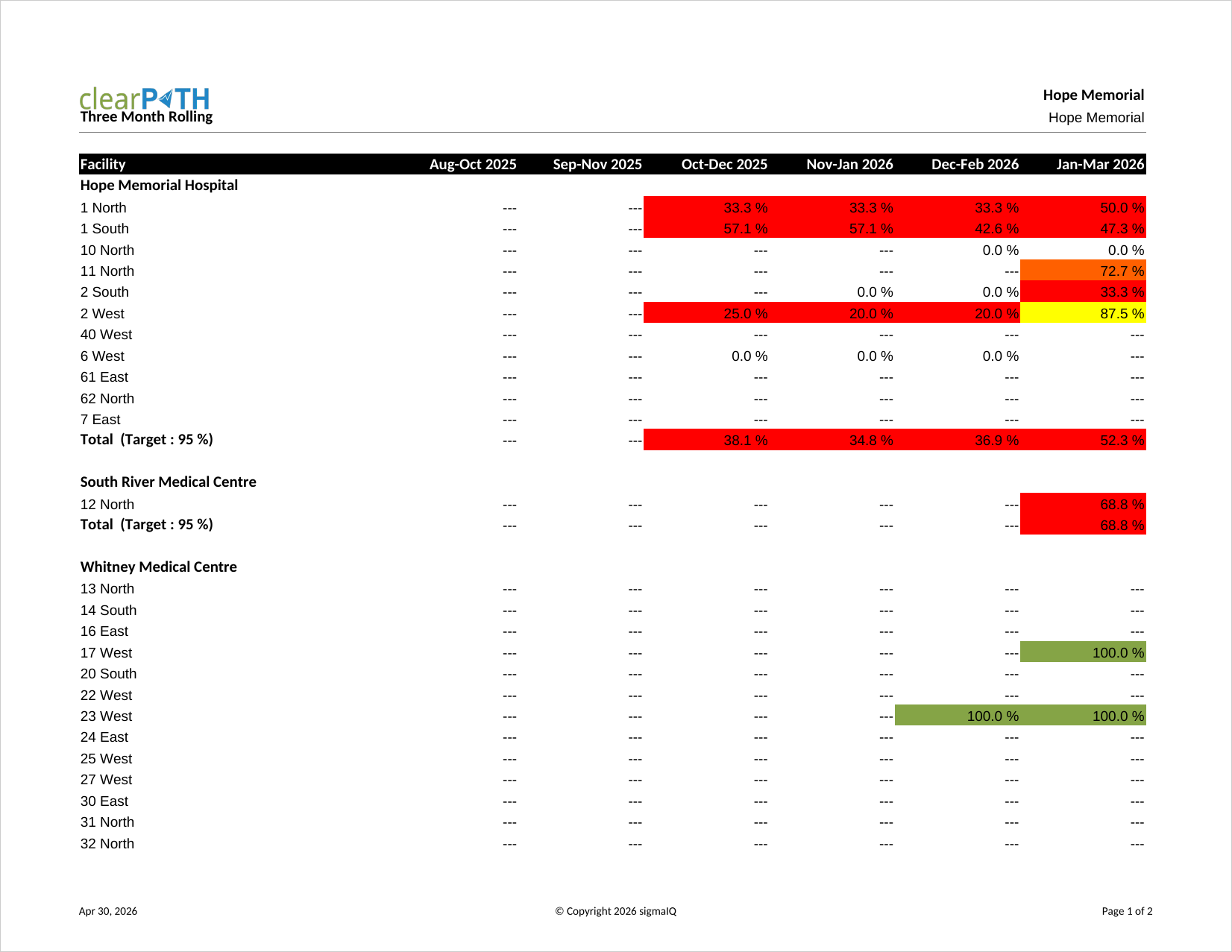
Three Month Rolling
Compliance for each of the three most recently completed months. Intended for rolling quality reporting where quarterly granularity is too coarse. The report period is defined by the report itself.
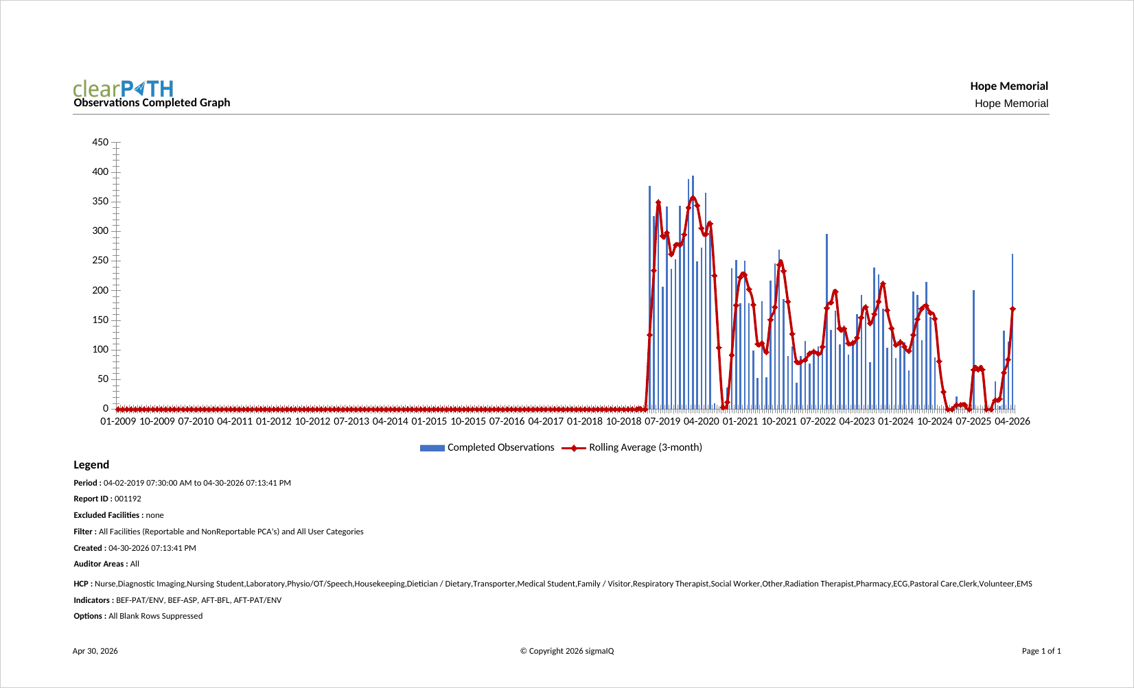
Observations Completed
Number of completed observations by month over the report period. The goal trend line is calculated from the number of observations defined in your auditing schedule plan. Audit program leads use it to confirm that auditing volume is keeping pace with plan.
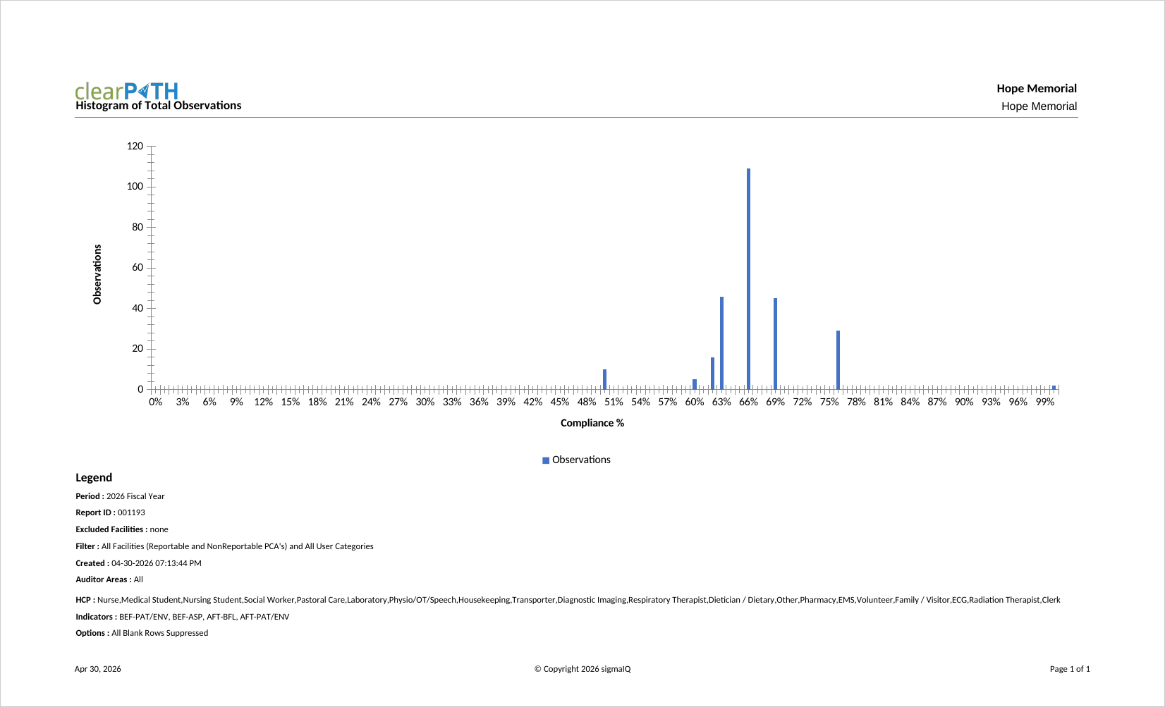
Histogram of Total Observations
Six different histogram views: distribution of percentage, day of the week, day of the year, week of the month, week of the year, and month of the year. Useful when there is a concern about bias in auditing — for example, when an auditor consistently audits on the same day of the week.
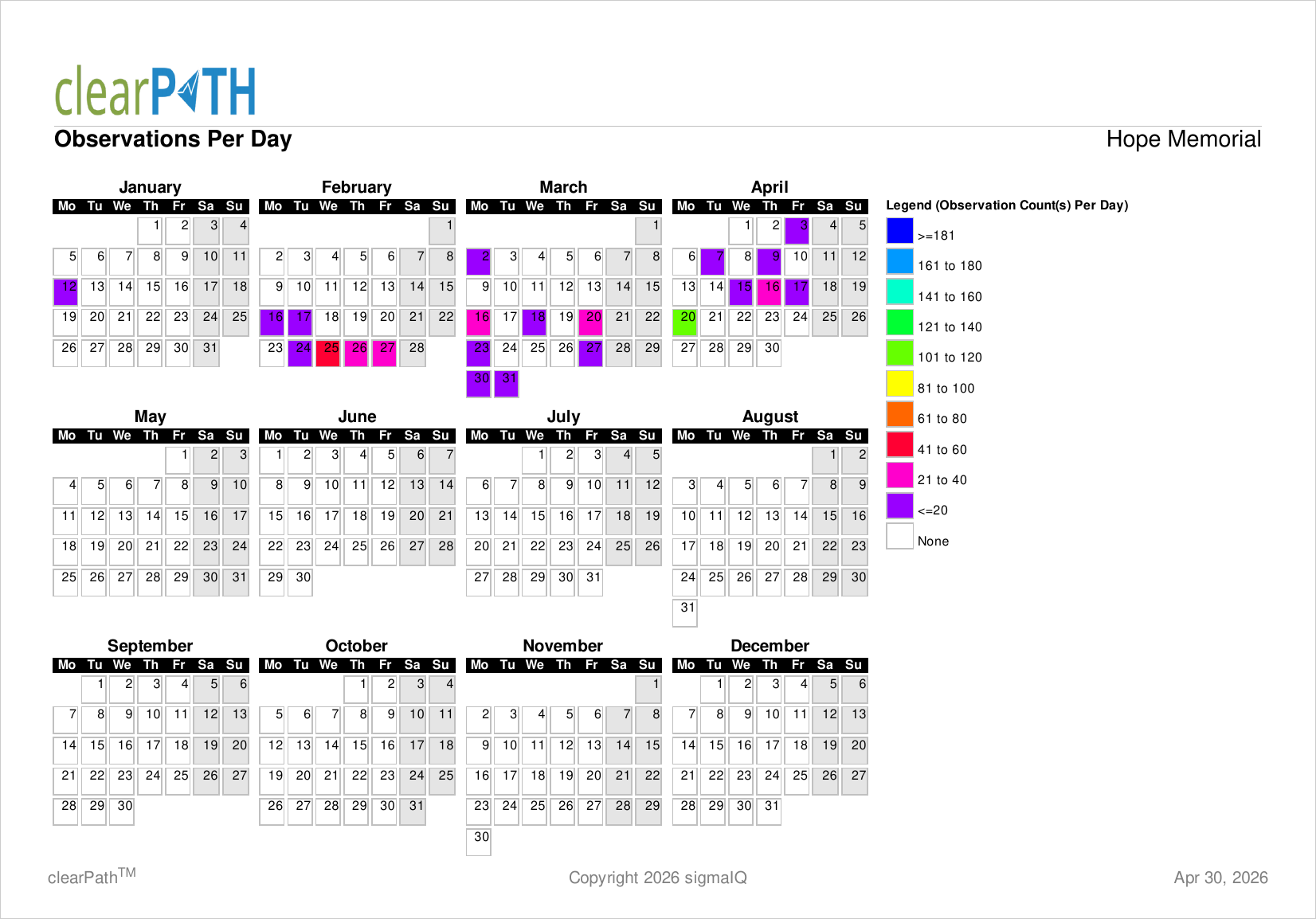
Observation Per Day
Total number of observations collected for each day in the report period. Each day is colour coded; days on which no observations were collected are white, weekends are light gray. Helps audit program leads spot clustering and gaps in daily coverage at a glance.
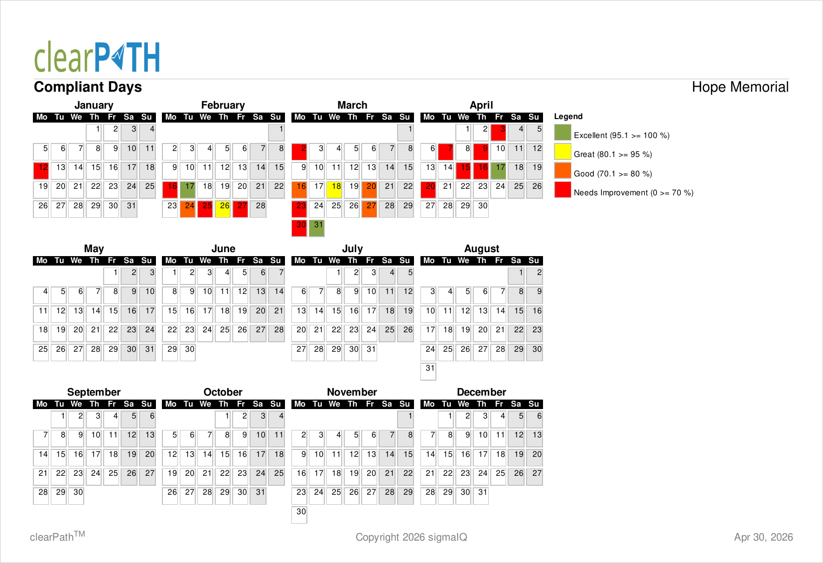
Compliant Days
Hand hygiene compliance percentage for each day of the report period. clearPath analyses all audit sessions collected on a given day and calculates a composite percentage, colour coded based on your account's colour ranges.
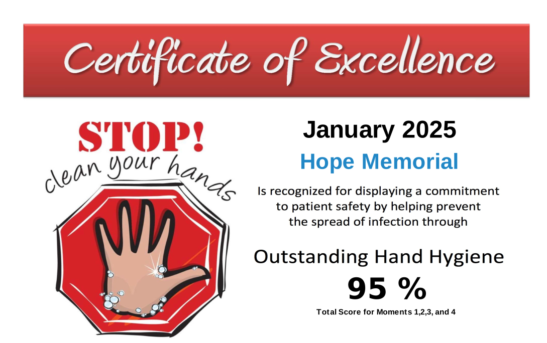
Certificate of Excellence
Unique among clearPath reports: it is the only report that is generated only when the facility, unit, or group achieves a hand hygiene compliance at or above the corporate threshold. Intended to be printed, signed, and presented to teams that meet the performance bar.
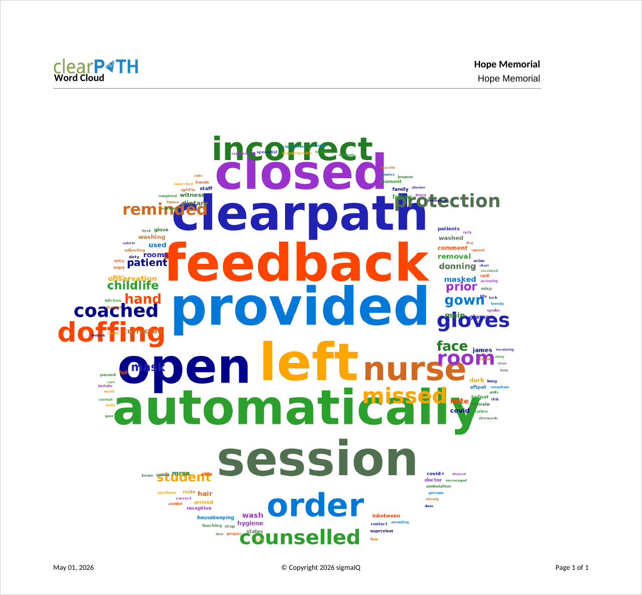
Word Tree
Identifies trends and keywords in the free-text comments collected by auditors. Each comment is split into individual words, checked against a do-not-include list, and rendered as a rectangle whose size and colour represent how often the word appears. Useful for uncovering recurring themes (equipment, location, workflow) that may warrant follow-up.
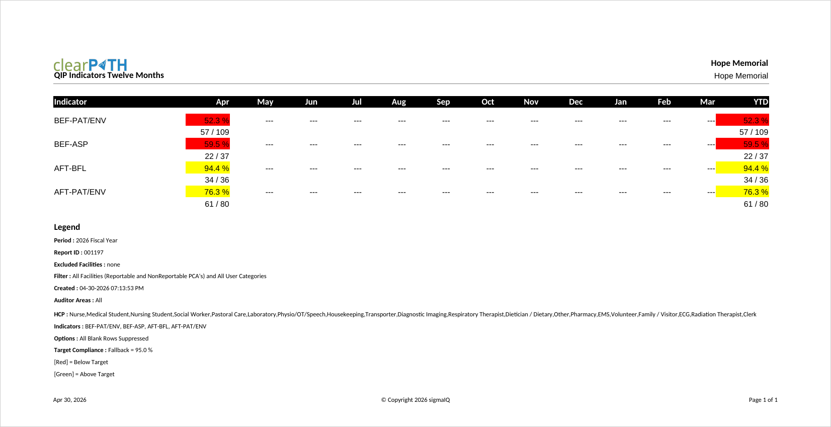
QIP Indicators Last 12 Months
Designed to support Quality Improvement Plan reporting. Shows indicator performance for the trailing twelve months against the organization's targets. Two styles are available: a dense tabular layout and a combined table-plus-graph layout. Green/yellow/red flags signal whether each metric meets, approaches, or misses target.
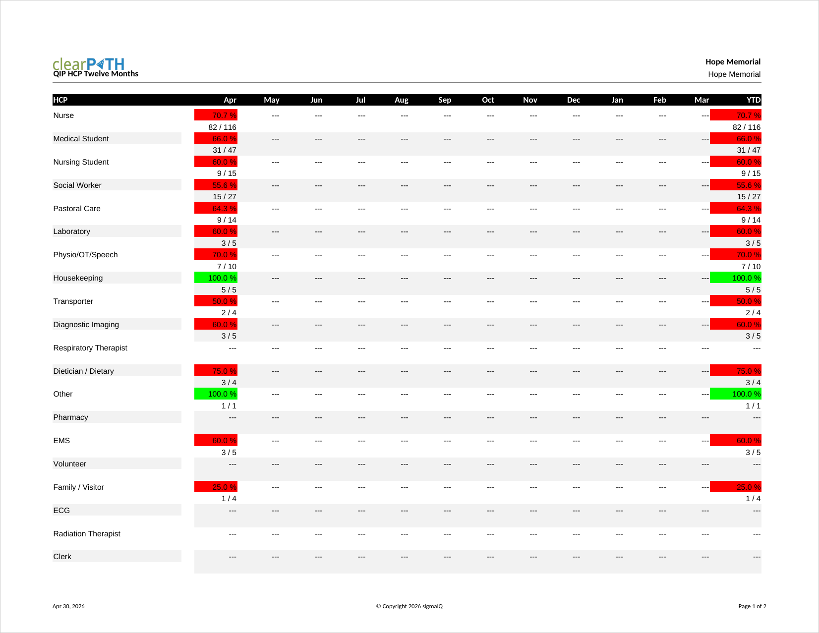
QIP HCP Last 12 Months
Health care provider performance over the trailing twelve months. Like the QIP Indicators report, it is designed to support Quality Improvement Plan submissions and uses the same three-colour scheme to flag metrics that meet, approach, or miss target.
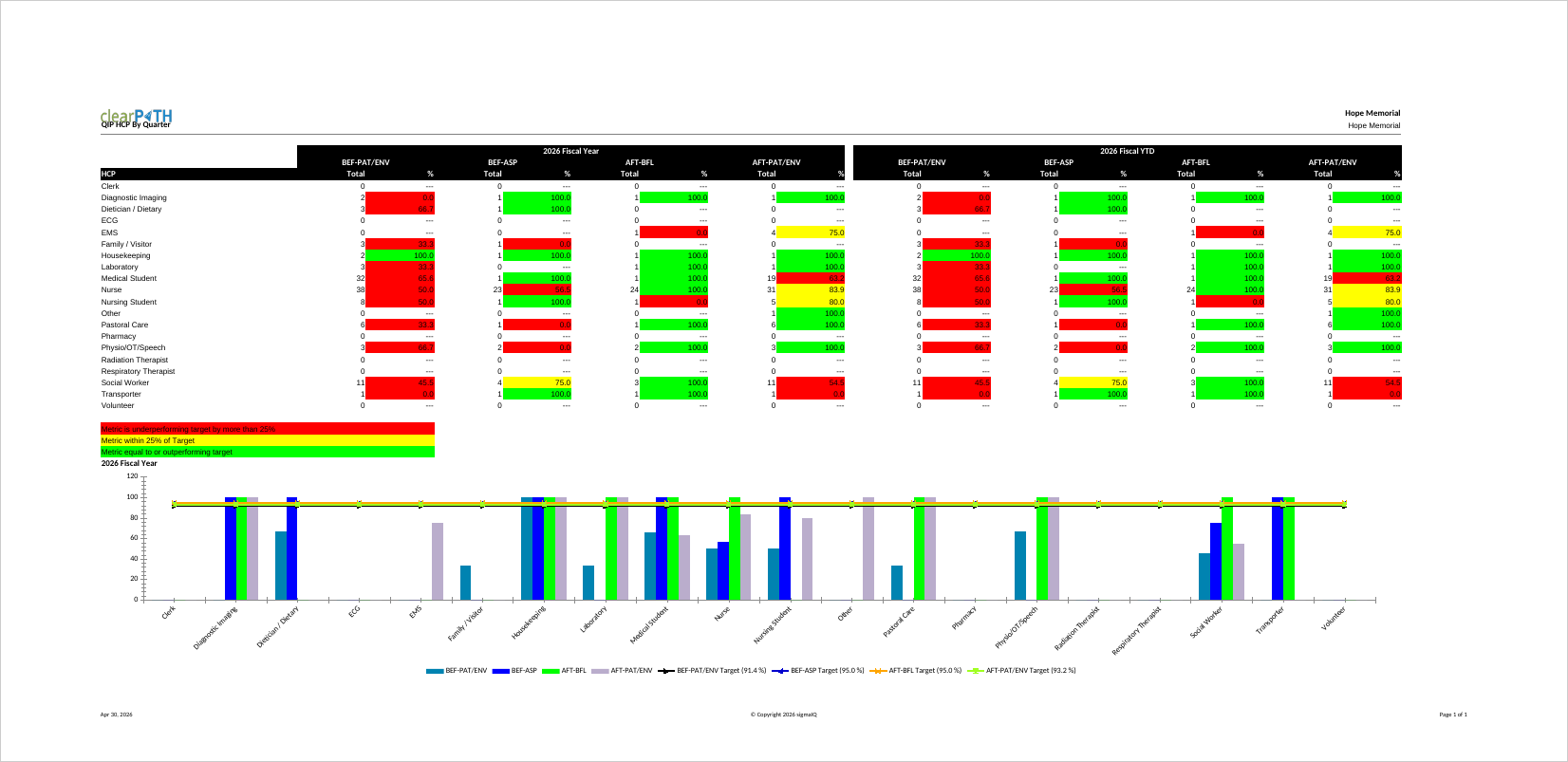
QIP HCP by Quarter
Health care provider compliance broken down by quarter, making it easy to spot seasonal patterns or the impact of education campaigns rolled out in a particular quarter. The chart automatically moves to a second page when more than ten HCP types are selected.
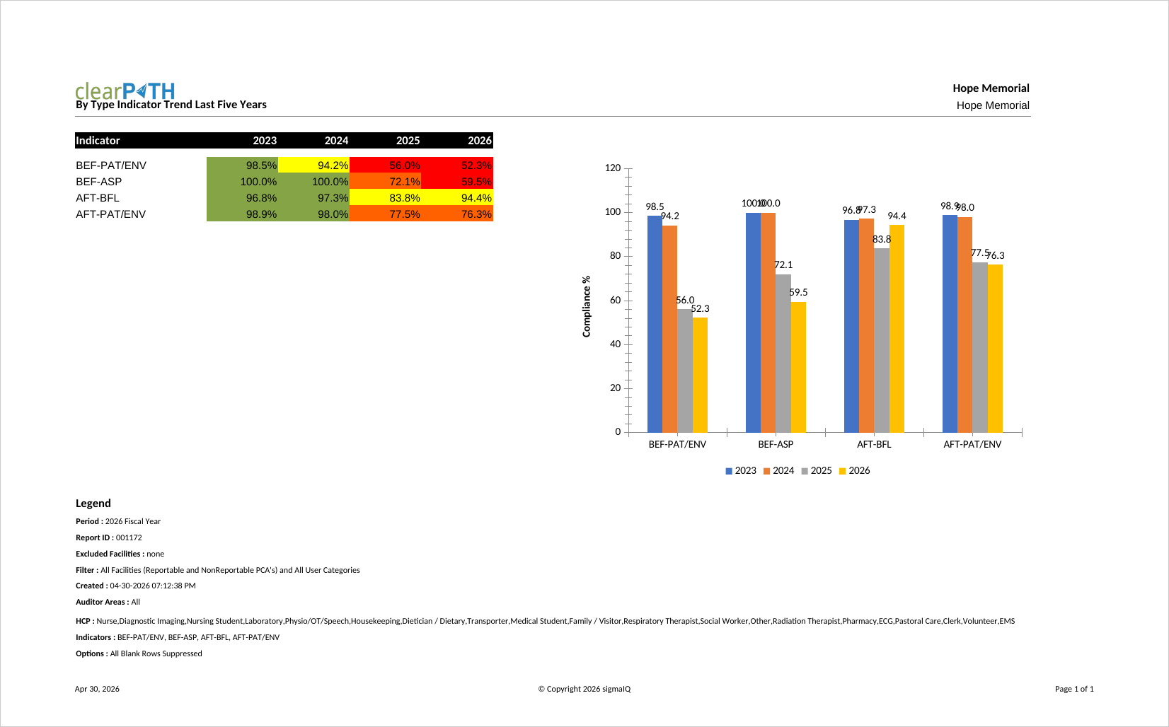
Indicator Trend Last Five Years
Plots compliance for each indicator over the last five fiscal years. A long-range view useful for senior leadership and board reports, especially when evaluating the multi-year impact of a sustained improvement program.
Indicator Trend Table and Graph
Pairs a table of per-indicator compliance values with a companion graph in a single output. Designed for audiences that want both the underlying numbers and an at-a-glance visual on the same page.
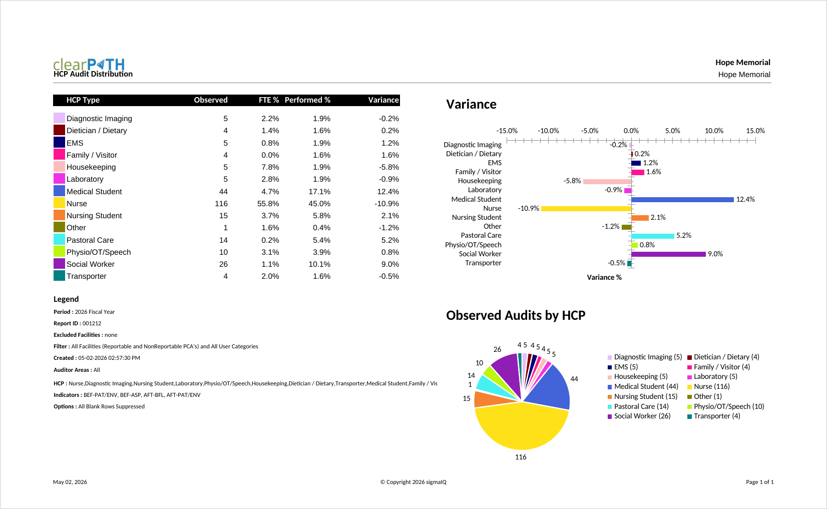
HCP Audit Distribution
Highlights whether one or more health care provider types are being audited too frequently or not frequently enough. clearPath compares the total observations collected for each HCP type against the total FTE in that role for the organization. The variance column shows the percentage and the number of observations that are over- or under-represented.
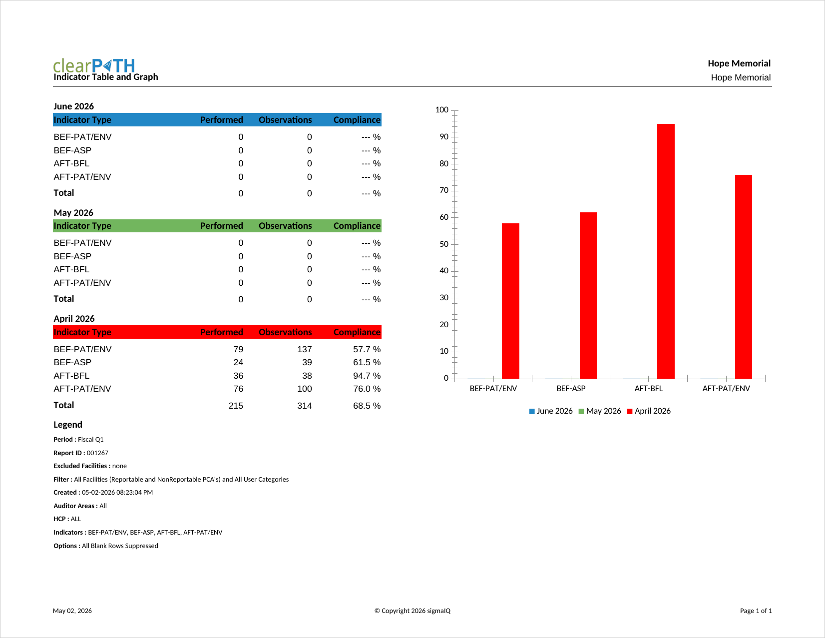
Indicator Table and Graph
Combines a per-indicator data table with a companion graph on the same page. Used by audiences that want both the raw numbers and the visual comparison without having to cross-reference two separate reports.
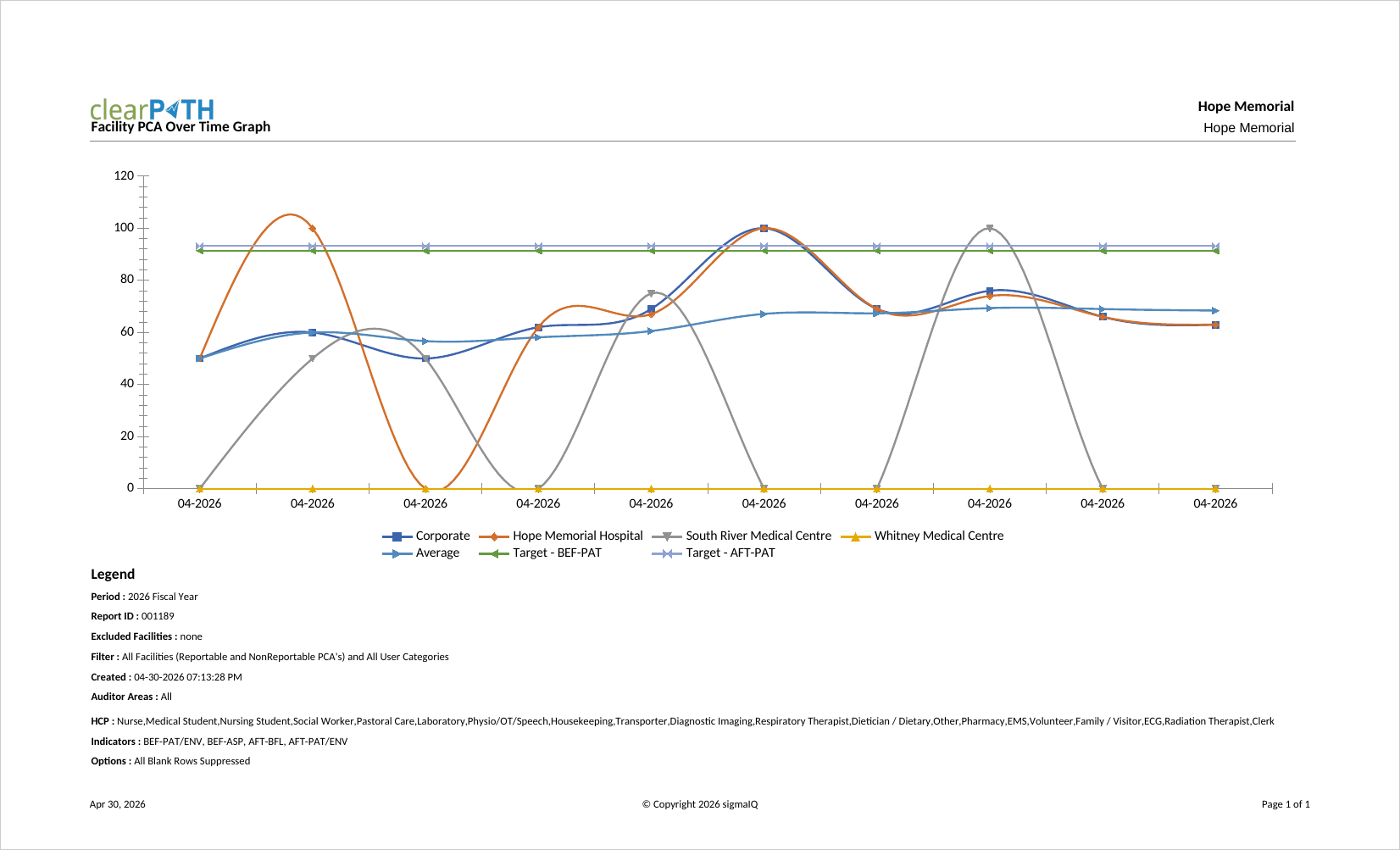
Facility and PCA over Time
Plots compliance for each facility and patient care area across the report period, giving senior leaders a side-by-side view of how every unit is trending. Typically used for executive rounds and for enterprise-wide performance reviews where ranking units against each other is important.
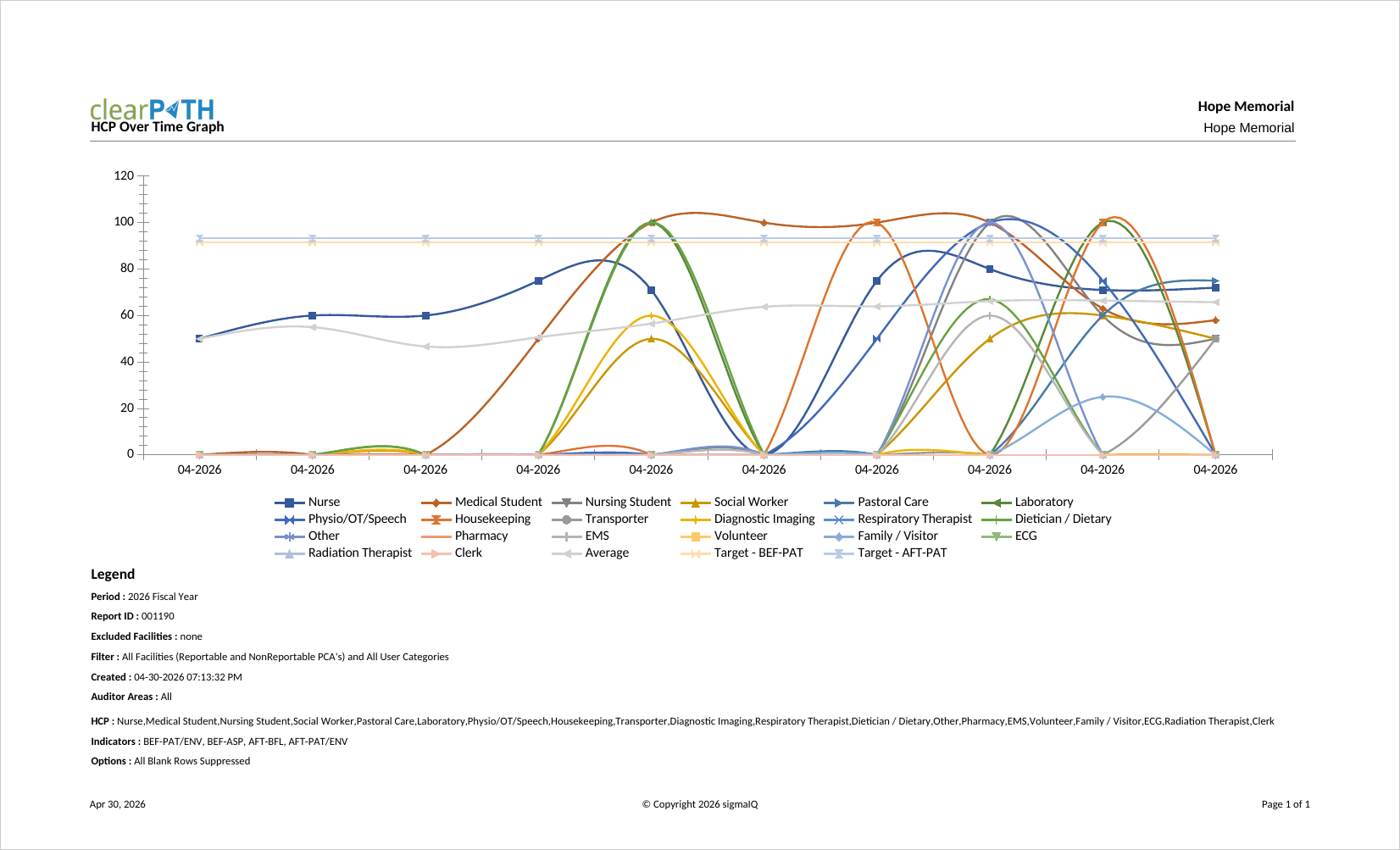
HCP over Time
Plots compliance by health care provider type across the report period. Used to confirm that improvement initiatives aimed at a specific HCP group (for example, physicians) are actually translating into measurable change over time.
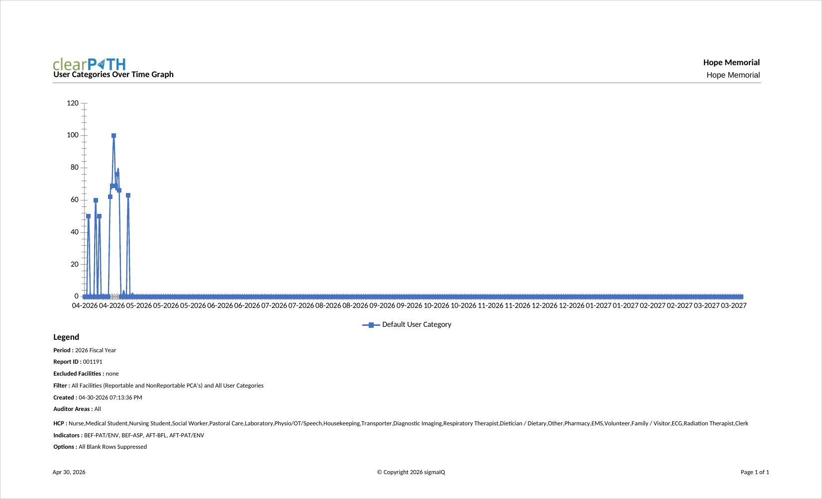
User Categories over Time
Plots compliance by user category across the report period. User categories are organization-specific groupings (such as floats, agency staff, or trainees), making it easy to compare how each group is trending against the rest of the workforce.
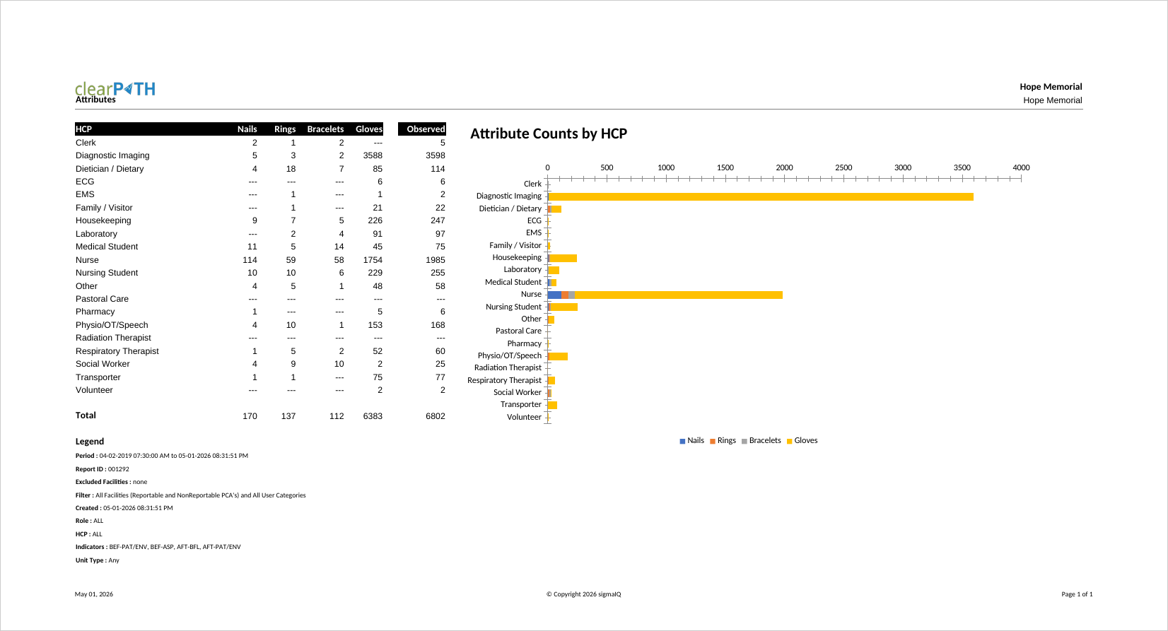
Attributes
Summarizes compliance broken down by the optional attributes captured during an audit session (for example, shift, PPE, or any custom attribute configured for your organization). Useful for testing hypotheses such as “does compliance dip on night shift?” without building a custom report.
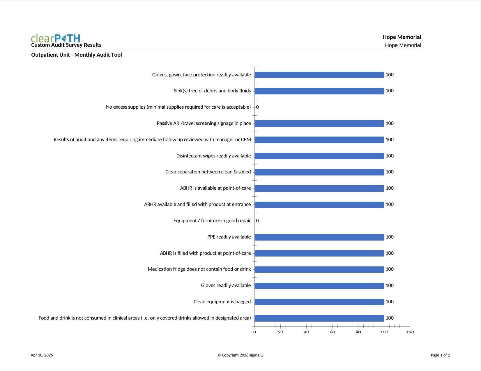
Custom Audit Survey Results
Returns the raw responses collected for a custom audit survey. Each question and each response is listed so that the survey owner can review the underlying data before it is aggregated. Commonly used to validate that a newly deployed survey is behaving as expected.
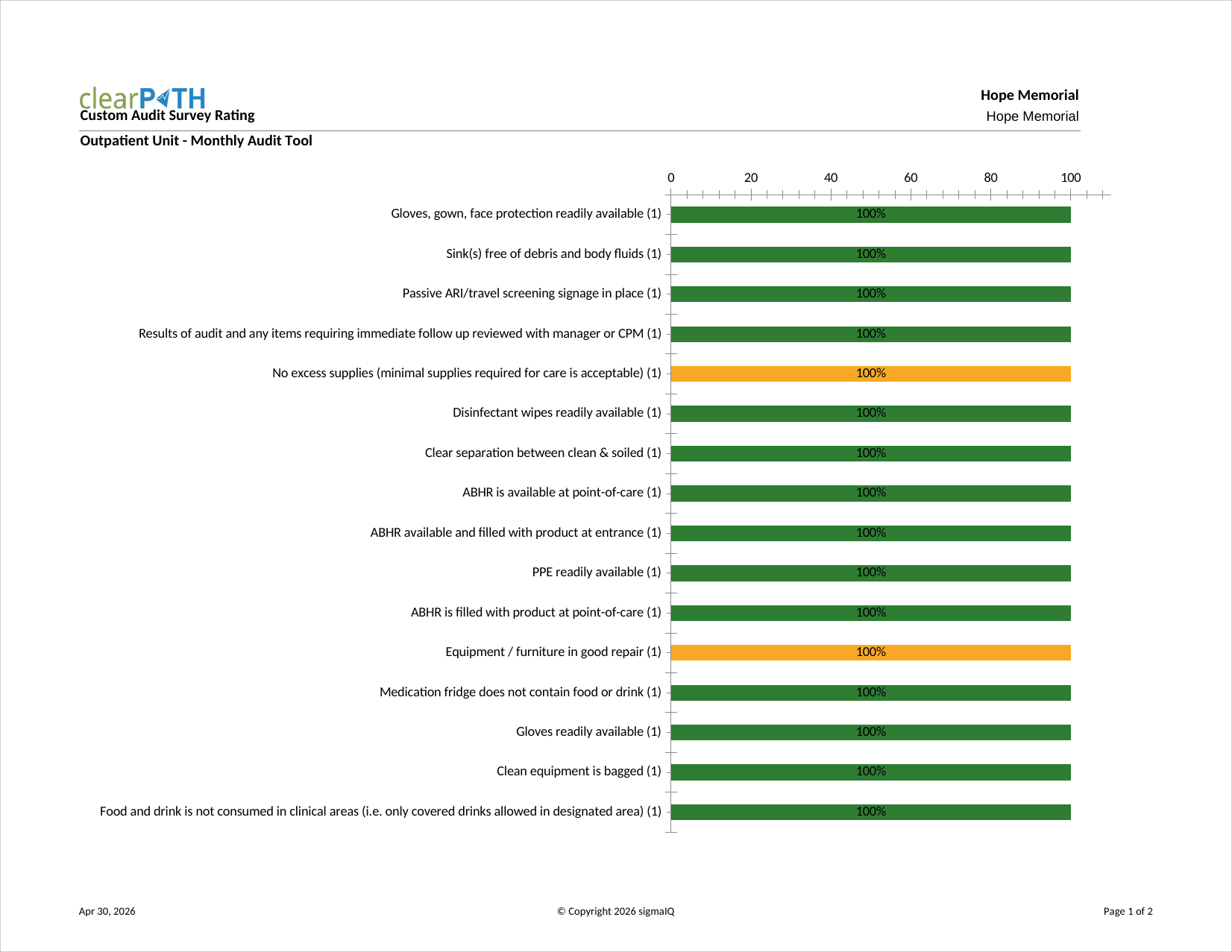
Custom Audit Survey Rating
Aggregates custom survey responses into a weighted rating per question and per respondent grouping. Used by program leads who want a single summary score that can be tracked over time alongside other compliance metrics.
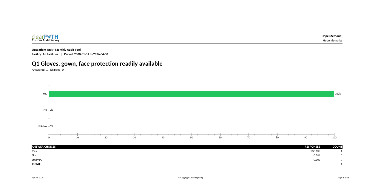
Custom Audit Survey
A printable version of a custom audit survey, including the question text and any structured response options. Typically used when a paper version of the survey is needed for field data collection or for training new survey administrators.
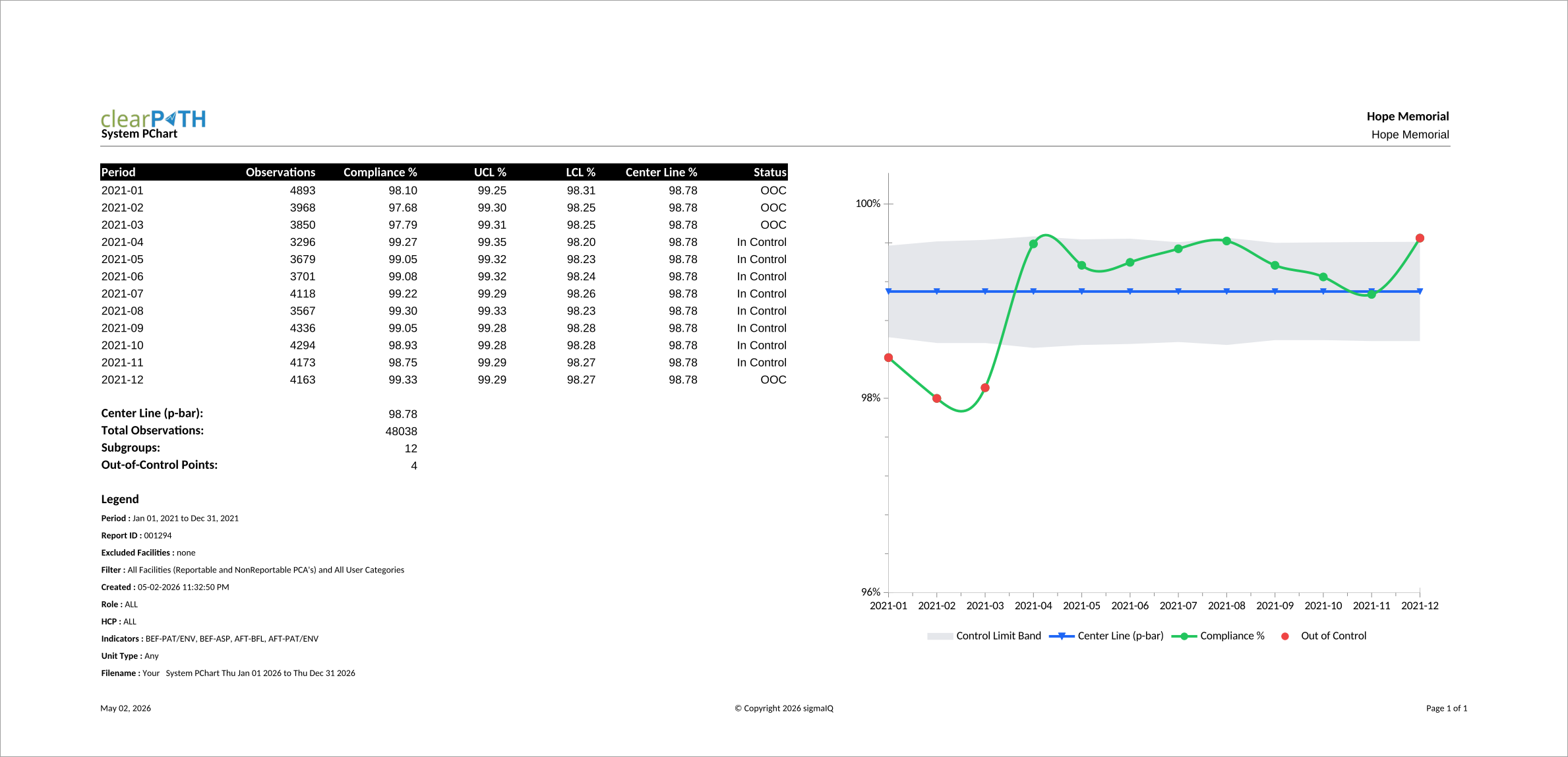
P-Chart
A Statistical Process Control (SPC) chart that plots the proportion of compliant hand hygiene observations for each subgroup (typically a month) against a calculated centre line and upper and lower control limits. Quality leads and infection prevention teams use it to tell ordinary month-to-month variation apart from a real shift in performance, so improvement work can focus on genuine signals rather than statistical noise. Points outside the control limits are flagged as Out of Control and warrant a closer look.
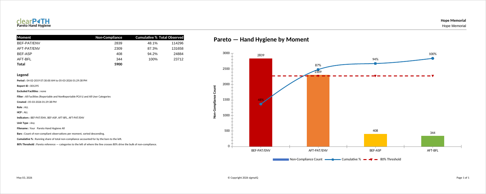
Pareto Hand Hygiene — Moment
Applies the classic 80/20 lens to non-compliance. Bars show the count of non-compliant observations per category, sorted from largest to smallest, while a cumulative-percentage line rides across the tops of the bars. A dashed reference line at 80% marks where the running total reaches the “vital few” threshold. Style A breaks non-compliance down by the WHO Five Moments for Hand Hygiene — with only five categories the chart reads at a glance, making it the most common starting point for quality leads and infection prevention teams.
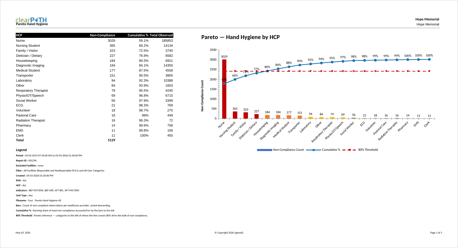
Pareto Hand Hygiene — HCP
Style B pivots the same 80/20 view around individual healthcare providers. Each bar represents one provider in scope, sorted from worst to best, with providers who had no observations in the period omitted. Use this style to highlight the small number of providers who account for most of the non-compliance — typically the target audience for one-on-one coaching or refresher education.
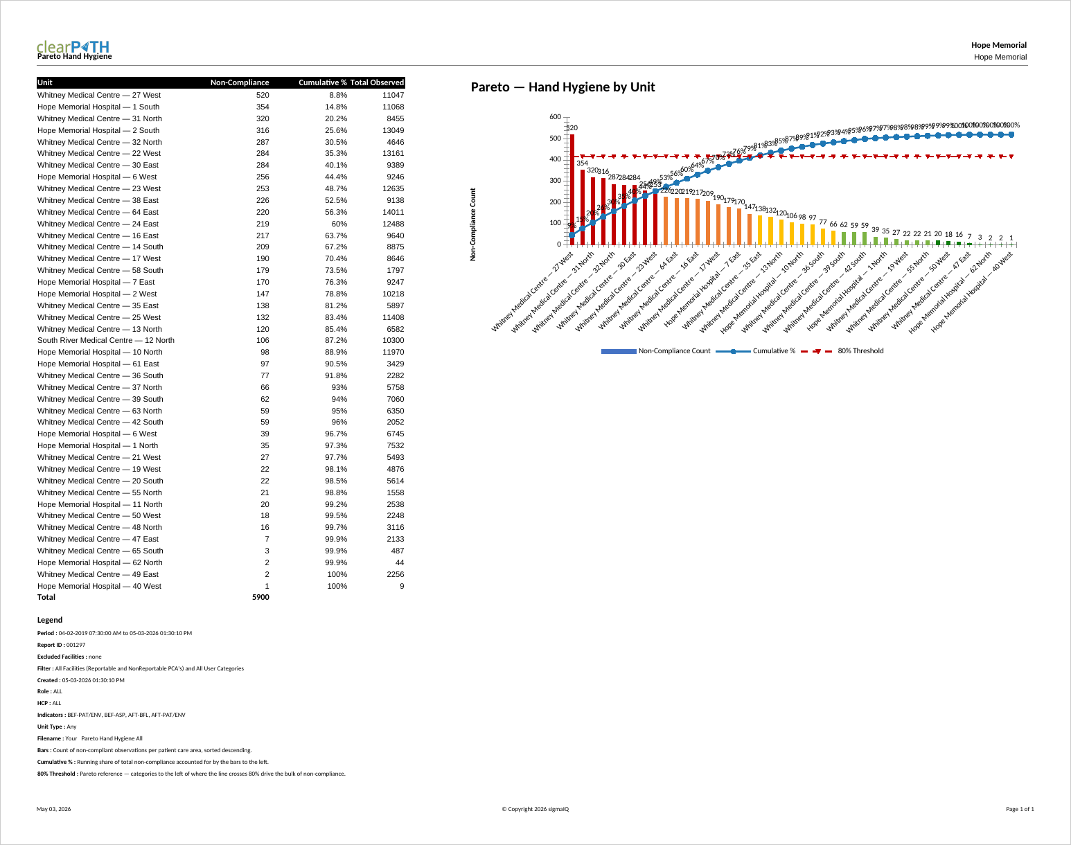
Pareto Hand Hygiene — Units
Style C breaks non-compliance down by patient care area. Bars are labelled with the facility and unit name (for example General Hospital — ICU), sorted from worst to best. Use this style for organizations operating across multiple units or facilities to identify which areas are pulling overall compliance down, and to direct in-service training, audits, or supply checks where they will produce the biggest improvement.
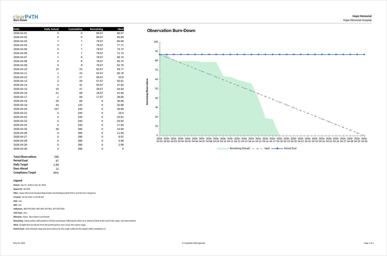
Burn Down Chart
The Burn Down Chart plots remaining observations against the daily target line for the selected period, counting down from the period's total to zero. It is used by audit coordinators and program leads who need to know — partway through a month or quarter — whether the team is on pace to meet its observation target, without having to do the math.
The slope of the actual line, compared against the straight-line ideal and the period goal reference line, makes the answer obvious at a glance: below the line means ahead of pace, above the line means catching up is required. The companion table reports total observations, period goal, daily target, days ahead or behind, and the compliance target.
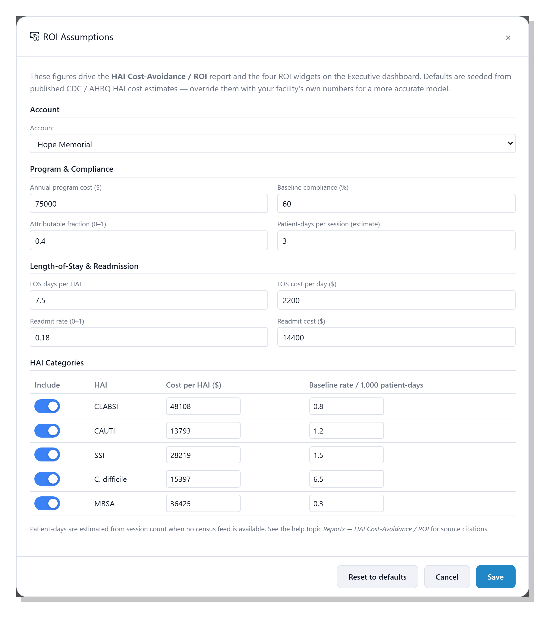
HAI Cost-Avoidance & ROI
A single executive page that translates hand hygiene compliance gains into a defensible dollar figure — the healthcare-associated infections avoided, the length-of-stay and readmission costs saved, and the net return after your program cost. Every input is tunable on the ROI Assumptions editor, with defaults drawn from published CDC, AHRQ, and peer-reviewed estimates, and the same model powers four live ROI widgets on the Executive dashboard. See the full ROI story →
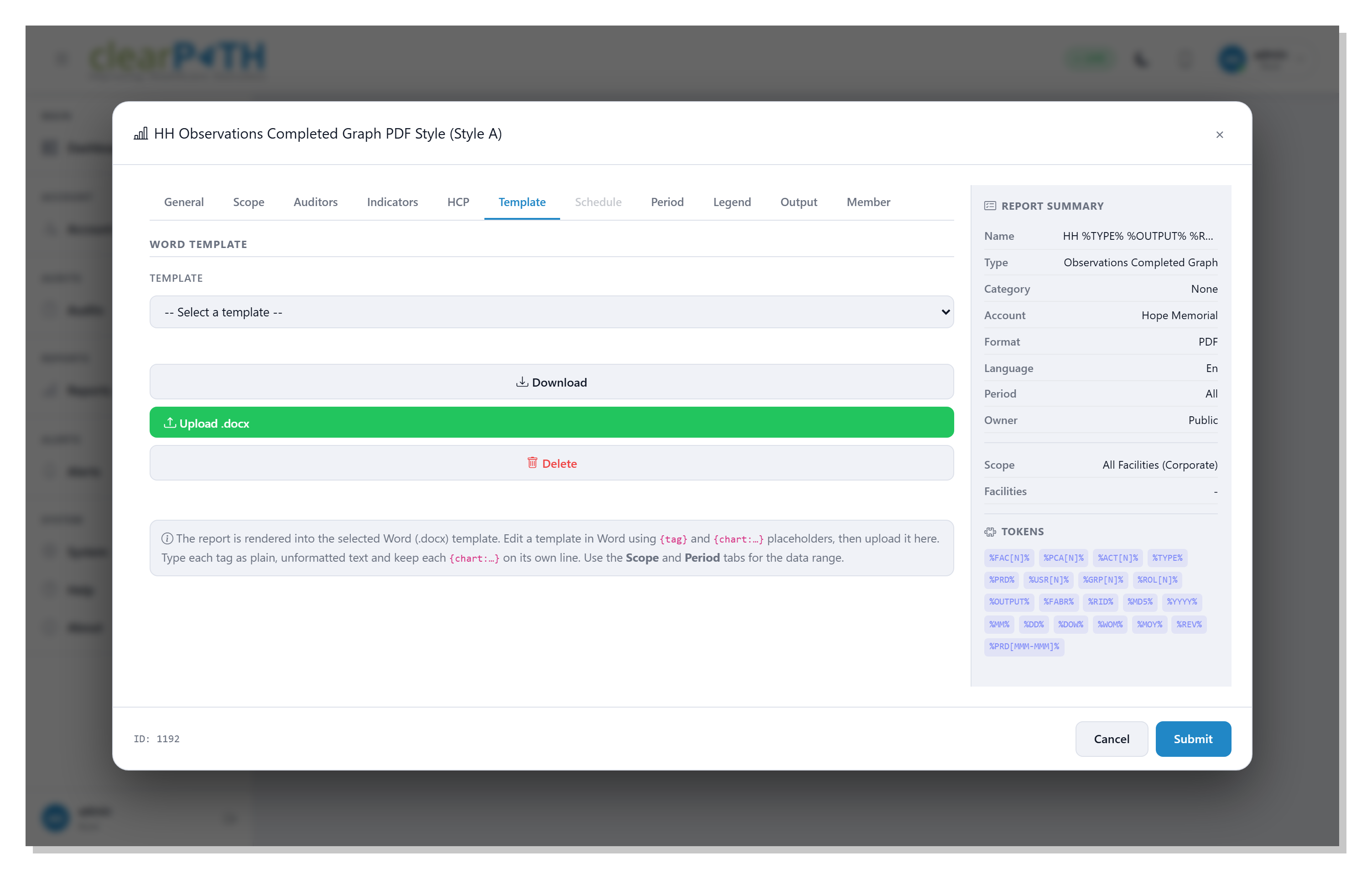
Word Template
Renders live compliance data and charts into a Word (.docx) template you control — your layout, fonts, logo, and boilerplate, with clearPath filling only the plain-text tags you place. A different template can drive each report from a per-account library, and the finished file is produced as Word or PDF. Set it up on the report editor's Template tab (shown here), where you select, download, upload, or delete templates. See how Word Template reports work →